25 Joanna Gaines-Inspired Design Tricks To Live By
Photographed by Tessa Neustadt for Amber Interiors.; Getty Images North America.
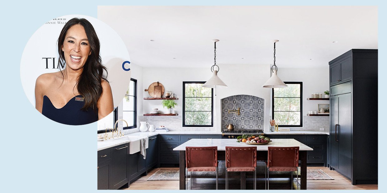
If you’re a fan of the HGTV show Fixer Upper, you definitely know about Joanna Gaines aka the queen of the modern-farmhouse style. Until 2018, she and her husband, Chip Gaines, starred in their own home design and renovation show where they took old, dilapidated homes and turned them into the updated space of your dreams.
After gut-renovating their first building, the pair realized they had a real talent for flipping houses in their signature style. As Joanna (or Jo as we like to call her) took on all things interiors, Chip managed the construction end of their design partnership. The duo became masters of creating spaces with clean, white walls highlighting original structures like wood beams, shiplap, and stained glass. Antique accessories, wrought iron, textured area rugs and industrial light fixtures often rounded out a signature Gaines design, too.
Self-made Chip and Joanna Gaines live in Waco, Texas, a small Southwestern town they have turned into a farmhouse-fan destination. The pair branched out from their TV show fame and created an empire as well under the moniker, Magnolia. The home-design store not only is an IRL location for folks to find items in the famous couple's style, but it also sells original furniture, decor, wall coverings, and more online as well.
For those looking for advice, Joanna Gaines offers her tips and an inside look at her designs on her blog, has multiple bestselling books, and produces a magazine, Magnolia Journal. The couple even owns three gorgeous rental properties available for bookings. If that’s not enough, the Gaines family also has accessory lines at Target and Anthropologie. And, perhaps most impressive? Joanna never even studied interior design.
Whether you’re a fan or just looking for some home inspo and advice, we’ve rounded up 25 tips and techniques straight from Joanna herself.
Design Trick #1: It’s In the Details
Photographed by Ana Kamin.
Take the time to appreciate and showcase the small details around your house, be it original molding or carvings on an antique door. Chip and Joanna are experts at this. They can see a dilapidated house and know that it’s special by noticing an antique stained glass window or an intricate fireplace. And, while we may not all have an eye for this kind of thing, Gaines offers a bit of advice in an Elle Decor interview.
“In the beginning stages of designing a home, the fundamentals should be your timeless elements. Everything else that you layer in are the pieces that tell your story — what will make your home feel personal,” Gaines said.
The “fundamentals” could be a couch or large piece of furniture, but it can also be the bones of the house. Survey your surroundings, find the original, existing details that speak to you and build from there. If you pay attention, you will notice that houses often come with their own built-in personalities and decor — especially old farmhouses like the ones Gaines renovates.
Design Trick #2: Shiplap
Photographed by Tessa Neustadt for Amber Interiors.
When you think “Joanna Gaines,” you probably think “shiplap” — and rightfully so! Chip and Joanna just love a good shiplap wall or ceiling. They even have a whole line of it at The Home Depot. It’s one of the cornerstones of the modern farmhouse style and a staple in a Gaines design project.
Sometimes on Fixer Upper, the couple finds original shiplap underneath drywall and paint it white. But, if your house doesn’t have that, you can always install it.
So what exactly is shiplap? It’s a technique in which horizontal slabs of wood are installed overlapping one another slightly. The idea is to create a water-tight surface that will be safe from mold and mildew. Many old farmhouses were built with shiplap, hence why Chip and Joanna are able to find the real deal so many times. But, to create the look in a house that does not already have authentic shiplap, all you need are some wooden planks and paint.
Magnolia Home By Joanna Gaines Shiplap White Paper Pre-Pasted Strippable Wallpaper Roll, $85.98, Home Depot.
Design Trick #3: Industrial Pieces
Courtesy of Marea Clark.
Industrial pieces are one of the hallmarks of a Joanna Gaines design. Light fixtures a great way to incorporate this look. You will often see darker, wrought-iron light fixtures and hardware in a Gaines-designed house. These pieces not only add some contrast to the soft, white base, but they are reminiscent of antique farm equipment.
In her blog, Gaines talked about how she was inspired to design in an industrial farm style:
“Ten years ago, Chip and I were taking a road trip to New Mexico. My Magnolia boutique was up and running and I distinctly remember trying to figure out what my specific design style was. I found what I was looking for when Chip and I stopped in a small town on our way to the mountains of New Mexico.”
“I saw farmland and silos — the lush green fields combined with the industrial galvanized cylinders, and chippy white paint spoke to me. From that point forward, everything I did from a design aspect was inspired from that picture in my mind,” she wrote.
Want to find the farmhouse chandelier of your dreams? We recommend checking out the wide selection at Lamps Plus.
Design Trick #4: White Washed
Courtesy of Marea Clark.
If you want a Gaines-style room, start with crisp, clean white walls. But, picking the right white isn’t as simple as it seems. Decide which shade is right for your vibe — warm, cool, gray-toned, or cream. Once you’ve done that, it will be much easier to design the rest of the room.
As Gaines’ Magnolia blog says: “Choosing the right neutral paint color can often feel like looking for a needle in a haystack. There are hundreds of whites, creams, and grays to choose from; yet the more you hunt, search, and sample, oftentimes they all start to look the same — and you’re left just hoping you make the right call.”
Still confused? To get you started, here’s a quick lesson in her shoppable Magnolia-brand white paint straight from Gaines herself:
“Shiplap equals creamy; One Horn White equals warm with a beige tint; Locally Sown equals darker-hued and can sometimes read as beige; Blanched equals traditional white with creamy beige undertones.”
Magnolia Home By Joanna Gaines Eggshell Tint Base Paint Shiplap, $46.99, Ace Hardware.
Photographed by Julien Fernandez.
When renovating a home, Gaines always keeps the integrity of the house by salvaging and updating original elements like fireplaces, windows, doorways, and built-in cabinets. These elements are what give a home character and make it special.
Structural integrity is also of the utmost importance because that’s what makes a home safe to live in, so sometimes original structures are just too old and decayed to keep as-is.
But, Chip and Joanna go to great lengths to restore these elements to their former glory while making them safe to have in the home. This may mean rebuilding a fireplace brick-by-brick or moving a door frame or window. It’s a lot of effort, but worth it if your end goal is to live in a truly unique home.
If you are renting, there are more simple ways to highlight antique details. Make an old fireplace the centerpiece of your room (even if it’s not a working fireplace) or showcase original molding by painting your walls a contrasting color.
Design Trick #6: Curb Appeal
Photographed by Molly Culver.
The outside of a house is just as important as the inside — if not more — as it’s the first thing people see. Painting the front door can be a fun way to add personal flair. Be sure to find a color that speaks to you and have fun with it! Who says your front door can’t be teal, pink, or purple? For that classic Gaines look, go for a bright red or stained wood. And as always, let the personality of your home’s original exterior shine through alongside your own.
Want to know some other ways Chip and Joanna add visual interest and curb appeal to the exterior of a house? Help it exude that modern-farmhouse look from the outside in with large planters on the front porch, rocking chairs, window boxes with flowers, window awnings, white painted brick, wrought-iron door handles, gas lamps, wooden fences, shutters, and wood beams.
Design Trick #7: Shop Flea Markets For Antiques
Photographed by Jenna Peffley.
Gaines is all about antiques and found items. A unique piece can add character and that signature Gaines farmhouse look to a room.
“One of my favorite things to do is go antique shopping at off-the-beaten-path shops and flea markets. I always get inspired when I see pieces from the past. They all have their own story and there is just something about a piece that isn’t mass produced but one of a kind,” she wrote in her blog.
Gaines may even center the whole design scheme of a room around one found item that she calls “an inspiration piece.” Here, she writes about one in her home:
“For my kitchen at the farmhouse, it was a piece that came out of an old church. This was the communion table and underneath the countertops was a container that held the holy water," she explained. "I just love this piece because of its story and the detail. It is now the focal point and anchor for my kitchen. Once I determined where I wanted it, the rest of the kitchen fell into place.”
Design Trick #8: Books As Decor
Photographed by Oriana Koren.
Books can be a fun and inexpensive way to add color and visual interest to a room. Stack them on a table or organize them in a book shelf. Collect old books at flea markets and tag sales for a rustic vibe or use colorful book jackets to spice up a neutral palette.
For a more modern look, organize your books by color and create a crisp, clean palette in your bookshelf or built-in. You can play around with using different shades of one hue or go full rainbow. Gaines tends to lean toward more muted colors and antique books with patina — think a weathered and worn-out edition of Pride and Prejudice, for example.
It’s also a great way to add your personality to a room in a subtle, almost secret way. Pick out all your favorite books or book titles that make you smile. Maybe even create a hidden message using the words on the book jackets.
The Lonny Home: Discovering & Cultivating Your Authentic Space, $19.54, Amazon.
Design Trick #9: White Subway Tile & Colored Grout
Courtesy of Katie Martinez.
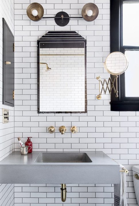
Opt for dark grout to add some contrast to standard white subway tile (another hallmark of a Gaines home). The tile originated in — you guessed it — the New York City subway system. It was used on the walls of underground stations in the early 20th century because its smooth, flat surface was easy to clean.
Today, subway tile has been having a major design moment. While some people are moving away from it, it remains a staple of the modern-farmhouse look. So, subway tile away! A dark black grout will give you a crisp, modern look, while a charcoal or gray is a softer, more feminine approach.
You can also add visual interest to a backsplash or shower wall by opting for an elongated subway tile and installing it in a diagonal herringbone design. This is something Chip and Joanna did in The Americano House, the last home featured on Fixer Upper.
Design Trick #10: Chandeliers
Photographed by Julia Robbs.
Gaines shared photos of her family’s newly designed farmhouse, where she uses traditional chandeliers throughout the house. The sophisticated light fixtures contrast nicely with the casual farmhouse design. You will find an antique chandelier hanging above Gaines’ dining room table, in her bedroom, and in her daughters’ room.
Gaines especially likes to use chandeliers above dining room tables, as seen in many of her designs. It’s a great way to add light (of course) and draw the eye down to the table, which is the focal point of the room. Sometimes with high ceilings, you actually want to lower the gaze to create a more intimate setting.
The style and material of the chandelier also greatly impacts the vibe of the space. Wrought iron exudes that clean farmhouse look; glass or crystal adds a whimsical, feminine touch; wood sets a rustic, masculine tone; bronze, copper, or gold give off a modern, elegant feel. Click here to find a chandelier that would fit your style.
Design Trick #11: Don’t Be Afraid Of Black
Photographed by Brett Warren.
Gaines often uses black accents, hardware, tile, and cabinetry to achieve her signature clean look. In her new home, she even opted for a black fireplace in the bedroom.
“Chip and I built the master bedroom as an addition to the original farmhouse, and while the room served its purpose in helping us rest and unwind, I was wanting to add some more color and depth to the space," she wrote in her blog. "The color palette of the original room felt a bit bland and I wanted to create a clear focal point, so we turned our attention to the fireplace. For a bold contrast, I went with a traditional black trim and antiqued glass over the mantel."
It’s a bold move, but as long as the rest of the room is light and airy, incorporating large, black statement pieces or even statement walls can be a great way to add a little drama.
Not sure which black paint is for you? We love this breakdown from Farrow & Ball to find your perfect hue.
Design Trick #12: Find Pieces That Speak To You
Photographed by Sara Ligorria-Tramp for Emily Henderson.
Many of the details in Gaines’s designs are unique items, and she recommends you do the same when designing for yourself. In an interview with Elle Decor, Gaines said it’s better to leave a space blank and wait to find a piece that speaks to you rather than to just buy a whole room at once.
“I think people are finally starting to understand the idea that a home will evolve over time... The pieces that you wait for are what make the process so fun. It’s never a good idea to buy everything from a catalog and be done,” she says in the interview.
“Obviously you need the basics, like a sofa or dining room table. But after that, it's good to look at a blank wall and say ‘I'm going to leave that wall blank until I find that very thing' that makes it meaningful to who I am.’ That's how you insure that a space feels authentic to the story you want to tell. It evolves.”
Design Trick #13: Use Bold Wallpaper In Small Rooms
Photographed by Nicki Sebastian.
Bold, printed wallpaper is tough to use in large spaces as it can tend to make a space feel cluttered and busy. In a small space like a bathroom or entryway, it’s “fairly low-risk in terms of the amount of real estate you’re covering,” Gaines explained on her blog.
“There are other benefits to incorporating wallpaper in small spaces. For example, in a bigger area, like a living room, you have more opportunities to bring in colors, textiles, wall hangings, or design elements that are representative of your style," she wrote.
"In a small space, you’re limited in what you’re able to do, and wallpaper is a great material to help bridge that gap. Additionally, hanging a print or pattern that you love in a small spot, like a desk or reading nook, can highlight that space in a way that helps it stand out within the larger context of the room."
You can find Joanna Gaines' entire line of wallpaper for sale over at Home Depot. Best of all? Many of them are removable for easy application.
Design Trick #14: Accent Walls
Photographed by Sean Litchfield.
Speaking of bold wallpaper, if you do want to use it in a main room, try it on one accent wall and keep the other ones plain. It’s a great way to incorporate a daring print that really speaks to you, but may be a little too extra to cover a whole room with.
“If you’re not wanting to wallpaper an entire room, start with covering just one accent wall. Hanging the print on one focal wall rather than everywhere allows you bring pattern into the room in a more subtle way," Gaines suggested in her blog.
"Wallpaper, with its many prints, textures and patterns has the unique ability to add individuality to a room. In a bedroom, accent wallpaper can set the tone for the room’s furniture and decor and bring in visual interest behind a bed frame. In a kid’s space, it can reflect their style and personality in a way that a shade of paint just can’t convey."
Design Trick #15: Area Rugs
Photographed by Jenna Peffley.
Design Trick #16: Church Pews
Courtesy of Katie Martinez.
Gaines is a big fan of using church pews in hallways or as bench seating along a large farm table. In fact, she even sells a church pew as part of her Magnolia collection. It comes in dark wood or painted white. You can also find similar pieces at Amazon and Wayfair.
If you really want an authentic antique piece but can’t find an actual church pew, a vintage or distressed bench does the trick too. Throw some pillows and blankets on it to create a cozy seating area in a hallway.
Aside from pews, Gaines often repurposes antique pieces from churches in her home. The kitchen island in her newly redesigned farmhouse was once a communion table in a church. It spoke to Gaines so much that she actually designed her whole kitchen around it.
“This island has become the character in my kitchen,” she wrote in her Magnolia blog.
Design Trick #17: Funky Accent Pieces
Photographed by Tessa Neustadt for Amber Interiors.
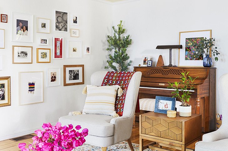
If you like a splash of bold color or funky patterns, go for it in the accessories. In her Elle Decor interview, Gaines advises homeowners to pick timeless furniture and liven it up with bold rugs, pillows, and shrugs — things that can be switched out if and when you get tired of them.
“I always say that the accent pieces — rugs, throws, pillows — are the items you can buy and replace easily, whether it's because you get tired of or a color, a pattern no longer works, or you're just over it in general," she said in the interview.
"It's always fun to refresh a space, and these pieces make it easy to do that. The basics, however, like sofas and chairs and coffee tables, are investments. It's important to really think through and do your research before purchasing those pieces. Ask yourself, ‘Will I love this in five years?'"
Design Trick #18: Open Shelving
Photographed by Tessa Neustadt for Amber Interiors.
Gaines is a big fan of open shelving in the kitchen. It’s a great way to break up a wall of cabinetry and show off your flatware and fine china.
“Open shelving is a functional design element that is easy to love. It brings dimension, gives your space a finishing detail, and is also a space saving and organization solution,” the Magnolia blog wrote.
But put some thought into it before committing to open shelving — especially know that you will never be allowed to have messy shelves! Magnolia offers some key questions to ask yourself before you install your open kitchen shelves:
What will you store on your shelves? Where will your shelves be hung? How much space do you have to work with? How much weight will the shelves have to bear? Where are your anchor points (the point where a screw will be drilled into the wall)?
Design Trick #19: Focal Point
Photographed by Tessa Neustadt for Amber Interiors.
When you are designing a large space, you want to direct the eye somewhere, otherwise you can end up with a hodgepodge of decor. Create a focal point around something like a fireplace, accent wall, or built-in unit in the living room. As we mentioned earlier, bold wallpaper is a great way to create an accent wall and focal point in a room. In the kitchen, a patterned-tile backsplash does the trick.
“If you’re wanting to try a patterned backsplash, but you’re a little nervous to venture outside of the traditional-style tile look, my advice is to use a subtle color palette and go with a timeless pattern,” Gaines advised in her blog.
“If you aren’t ready to commit to a color for the backsplash, consider painting your island a great color or paint your lower cabinets.”
Gaines also reminds us that tile is not the only option for a backsplash. Veined marble is also an elegant option.
Design Trick #20: Divide Open Spaces
Photographed by Tessa Neustadt for Amber Interiors.
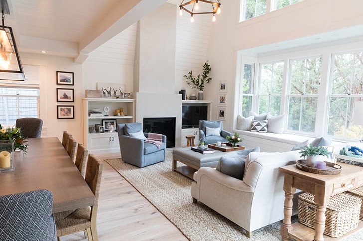
While we’re talking about large spaces, open-concept homes are great because they feel big and, well, open. But, you want to define the separate living spaces. Where does the living room end and the dining room begin? Gaines often uses area rugs and light fixtures to divvy up the area and create multiple “rooms” within one big floor plan.
Big open spaces can sometimes be even more challenging to decorate than small ones. Not enough elements? The space just feels empty and uninviting. With too many elements, you run the risk of just ending up with a big mess of stuff. Gaines’ solution is to create “vignettes” in the space.
Vignettes are simply smaller spaces created within a bigger one. Think, for example, a reading nook, a seating area, or a small cafe table by a bay window. Smaller defined spaces will make your open-concept home feel cozy and inviting, rather than cold and expansive.
Design Trick #21: Plants
Courtesy of Amber Interiors.
We dare you to find a Joanna Gaines-designed space that doesn’t include some sort of greenery. Plants bring life into the homes, and can make a world of difference. Some of her favorites are olive trees, hoya, and snake plants. Want to learn about these plants and the types of environments they thrive in?
Olive trees like a warm, Mediterranean-like climate. They prefer lots of sun and moderate water. According to Magnolia, “The visual simplicity of an Olive Tree is what makes it one of Jo’s favorites. These trees love sun and are sensitive — so try not to move it around too much after you’ve found a good spot.”
Interested in a Hoya? “This low maintenance beauty will develop clusters of pink flowers with crimson centers as it matures,” Magnolia writes. Hoya plants like full sun and light watering.
Snake plants are perfect for you if you don’t have a green thumb, or just don’t want to invest too much time and energy into plant care. They are essentially indestructible. They prefer full sun, but can do just fine in a low-light environment. Plus, they require very little water.
Design Trick #22: Fresh Flowers
Photographed by Nicki Sebastian.
Similarly, fresh flowers can instantly bring joy to a space. And, while you’ll have the same houseplants for years (hopefully), you can switch up flowers to decorate according to the seasons or holidays. Flowers are important to Gaines as they are what gave her the inspiration to start Magnolia in the first place. She wrotes in her blog that she was inspired by the image of people carrying “fresh cut flowers wrapped in simple brown kraft paper” out of a flower shop in New York City. When she decided to open a shop in Texas, that’s what she wanted to sell. From there, it evolved into Magnolia.
Gaines offers a few tips on how to DIY a professional-looking floral arrangement: Use floral foam soaked in water as the base of your bouquet, have an uneven number of flowers, cut the stems at an angle, and add filler like greenery or small flowers if you wish.
Of course, you can always purchase a great arrangement, too. We love the ones at The Sill which can be shipped right to your door.
Design Trick #23: Let There Be Light
Courtesy of Marea Clark.
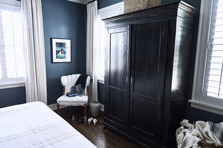
If you’ve ever had a bout of seasonal depression, you know how important sunlight is! On Fixer Upper, the Gaineses will install new windows where there isn’t enough natural light. But, creating a new frame isn’t exactly a casual thing. A quick and easy way to maximize the natural light you do have is to forego window treatments altogether in rooms. If you do want an option for privacy or because the room gets too much sunlight at certain times of day, try something out of the ordinary like indoor shutters.
“Incorporating unique window treatments can really make a difference in a room,” the Magnolia blog shared. "Blinds or curtains are the typical go-to, but using bi-fold shutters adds an extra layer of character that is harder to achieve with classic window coverings. They’re also fully functional — easy to open during the day to let in natural light and then close at night for privacy."
Design Trick #24: Grown-Up Kids Rooms
Photographed by Claire Esparros.
As we said, Gaines likes a chandelier. She tends to use them in kids rooms, too. Elegant light fixtures can make playful rooms look sophisticated and tie them into the rest of the house. Chandeliers are also great because they grow with a child; they are just as appealing to little girls as they are to teenagers and full-grown women.
“For any kid’s room, it’s important to consider their personality while also keeping in mind that you don’t want them to outgrow the design in a few years," wrote Gaines in her blog. "For Ella and Emmie Kay’s room, the changes we made were to reflect their growing personalities. I upgraded their bed, and brought in bolder, more refined furniture.”
“One of my favorite details we added are the vintage arched doors. I didn’t want to completely lose the whimsical element that are so fun in a girl’s bedroom, so I kept the vintage chandelier."
Design Trick #25: Inspiring Workspaces
Photographed by Sara Tramp-Ligorria for Emily Henderson Design.
If you work from home, designate at least a little corner of the house as a home office instead of just plopping down at the kitchen table with a laptop. Creating a space in which you actually enjoy working will inspire you.
One of the most important things when choosing your office space is lighting — whether it be natural or artificial. You have to see what you're working on after all!
“Ideally, natural light would be key, so look for an open space near a window first,” the Magnolia blog suggested. “If that isn’t an option for you, a lamp or sconce that projects warm, soft light is a good alternative for your desk. If your workspace is small, you may also consider purchasing a floor lamp or a lamp that hangs from the wall to save desk space. Additionally, make sure there is an outlet close by so that you can plug in your lamp or charge your computer as needed.”
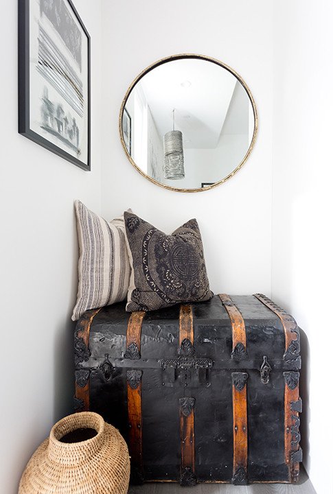
Design Trick #26: Make Use Of Nooks
Photographed by Amy Bartlam.
Sometimes, a home just happens to come with some awkward nooks and crannies. There may be a recess in the wall that seems to have no point to it. Or, there could be a small alcove that could be used, but there's no clear idea of what should be placed there. Joanna Gaines constantly encounters this when she's renovating homes and uses it as an opportunity to get creative.
"Giving a space purpose doesn’t mean it has to be utilitarian. Take a moment to consider the things that inspire you or that you want more of in your life," shares Joanna Gaines in her blog.
Take this space for an example. Here, a tiny niche in the wall seemed to be there for no reason at all. Instead, its designed decided to make a design moment within a bedroom, transforming it into an area for seating, art, and even storage.
Design Trick #27: Convert An Unused Room
Photographed by Ashley Batz.
Sometimes, whole rooms are used for the wrong purpose. There can be a space in the home that serves little function at all that can be turned around with a little design help.
"We all have underused or perhaps even misused spaces at home, and we all have reasons they stay that way," explains Joanna Gaines on her site. :Maybe it’s too much trouble to rethink the laundry room, even though you have square footage to spare — only that square footage has been functioning as storage space lately. Instead of waiting for the future, create what you need right now. Consider converting a room that only gets used occasionally, like a guest room or sunroom, into your dream laundry space."
That's exactly what homeowner and designer Gina Gutierrez did within her own San Francisco pad. Instead of letting a sunny spot work solely as little sunroom in her home, she added in laundry machines to make the most of what space she had.
Design Trick #28: Create A Library
Photographed by Heidi's Bridge.
Very few have their own libraries or built-in bookshelves but this design element really lends old-school charm to a house and gives it a classic yet bold edge. Gaines is particularly a fan of this choice and added one into a former conference room in her Magnolia offices.
"There’s something so cozy and transcendent about a library — being surrounded by books, old and new, that can transport you to just about anywhere. I wanted people to feel that way in this space," shared Gaines on her blog. "I wanted them to use it as a resource to learn more about topics ranging from home design and cooking to graphic design and business. A library seemed like a practical and pretty way to keep our team feeling inspired."
This house in upstate New York owned by Colu Henry, author of Back Pocket Pasta, also tapped into the library idea. Through adding one to the dining room, it gave a unique dose of color and personality to the space.
Design Trick #29: Re-Approach Awkward Spaces
Photographed by Becky Kimball.
An attic isn't only meant for keeping old holiday decorations or family photos tucked away in boxes. It's true that these spaces can often have weird architectural angles and perhaps even a good amount of dust or even vermin you need to clear out. But, there are still so many possibilities for this room.
"The area under the eaves at the top of the house is easy to neglect or relegate to storage. The square footage that an attic offers can meet endless needs," suggested Joanna Gaines on the Magnolia blog. Instead, consider the possibilities that can take place with these rooms. Will a fresh coat of paint and a little styling, they can easily be converted into an entirely new kind of space.
Instead of letting an attic stay dark and creepy, paint it a bright, white hue, add in some fun accents, and make it a home office or even a spot for the kiddos to hang.
Design Trick #30: A Seasonal Tablescape
When decorating the table for the holidays or even just entertaining a few friends for dinner, it's good to approach your tablescape with the seasons in mind. Joanna Gaines finds it is often a good idea to incorporate natural elements that integrate easy and simple pieces that feel comfortable and elevated all at the same time.
"It’s natural to feel like you have to go out and spend money on brand new pieces, but before you do that, first determine if you already have dishware and silverware tucked away somewhere that just needs a little dusting off! Or, if you’re excited to buy something new, layering it with existing pieces makes for an organic look," shared Gaines with Magnolia. "Varied candlesticks, a table runner, dried or fresh florals, and customized place settings help make your table feel intentional and tailored to your guests."
If you're in a pinch, head out to the garden to find a few items to spruce up your design.


