Ode To Nostalgia | At Home With Cath Kidston
Written by Shawn Gauthier | Photographed by Patrick Cline | Produced and Art Directed by Michelle Adams
Our product recommendations may include items from our sponsors and/or contain affiliate links, which means we may earn a commission when purchases are made. Rest assured, every item is genuinely chosen by our editorial team.
From Our Archives
Inspired by her English heritage, Cath Kidston furnishes a historic Chiswick home with her signature aesthetic.
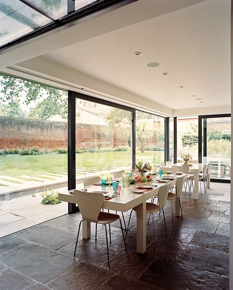
Cath Kidston’s days are not for the weary. As the eponymous founder and creative director of one of England's most successful textile and household accessory brands, Kidston spends from dawn to dusk managing everything from the design department of her empire to upcoming book collaborations, all while popping into as many car-boot sales as she can muster. Then, when her hectic day comes to a close, it's the comfort of her home she seeks, particularly her kitchen. "It's quite fantastic to come home in the evening to find the afternoon light still lingering," says Kidston, who outfitted her kitchen with large glass panes in place of walls. "The glass keeps in the light and connects the garden with the kitchen. It really captures the feeling of indoor-out."
The abundance of natural light is among Kidston’s favorite aspects of the Restoration riverfront home she shares with her partner, music producer Hugh Padgham, and stepdaughter, Jess, off a quiet, winding road in Chiswick. Originally split into two flats, the couple renovated extensively after purchasing the house ten years ago. And though the kitchen has been modernized, much of the home remains true to its original 18th-century design. "[The home] is friendly, warm, relaxed, and comfortable," says Kidston. "It's totally about nesting, making a nice, cozy place for us. It's very much a family home."
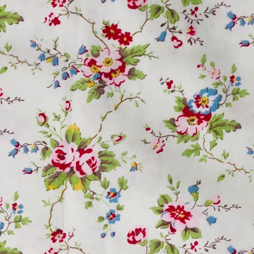
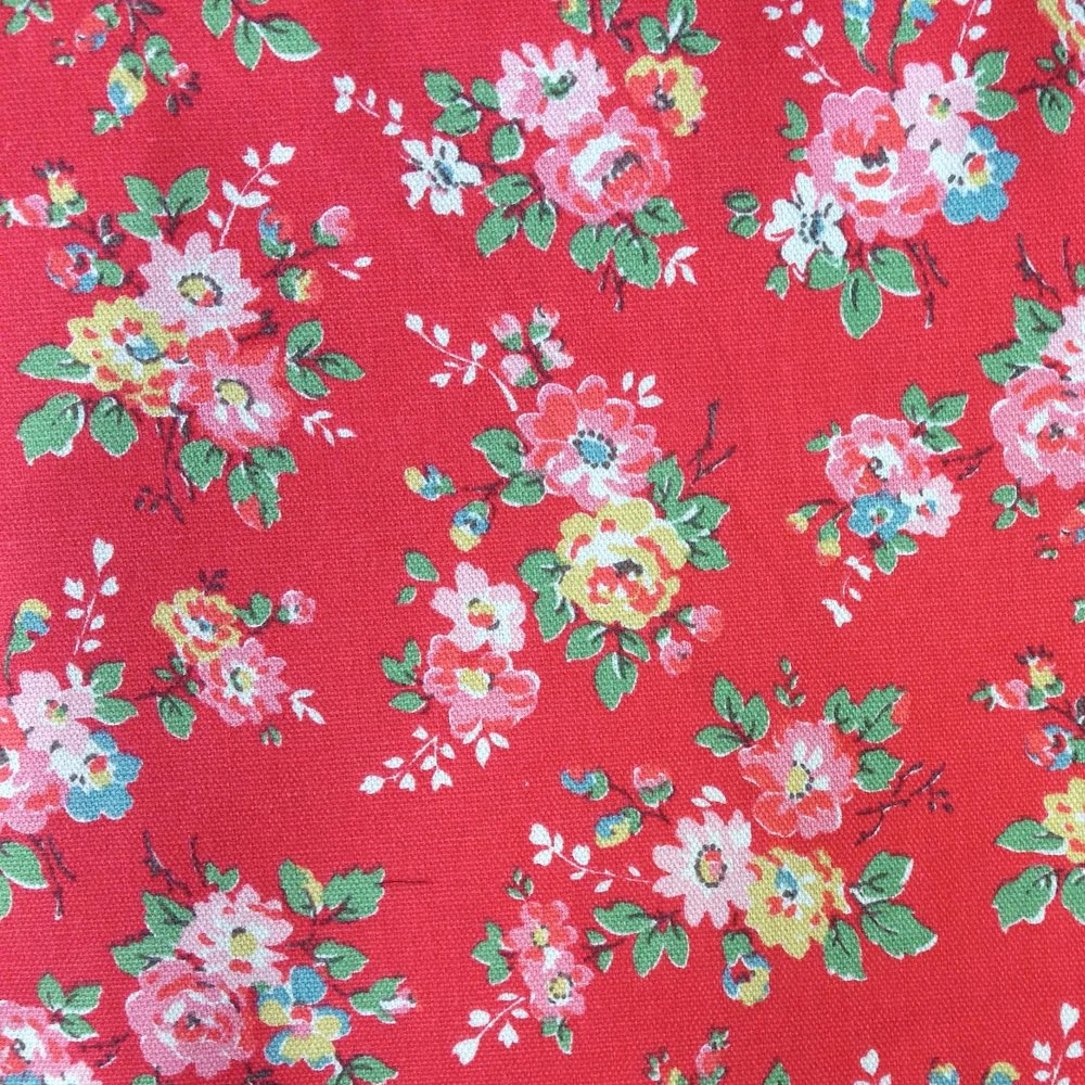
Commonly referred to as the Queen of Florals, Kidston notes that her brand has extended well beyond the early botanical designs she still "loves to bits." Over the years, she's enhanced her staple prints with lively patterns such as stripes, polka dots, and stars. "Our prints often maintain the same color threads so you can mix a big stripe, a little flower, and a polka dot, and still pull it all together," she says. Her home reflects this knack for artfully blending colors and styles, incorporating nostalgic references to her English childhood and maintaining an air of stately chic. Mostly, however, it represents the personality of her family. When it comes to design, Kidston rules the roost, but she does allow a little give and take. "Hugh minds things like how big the TV will be, you know, typical bloke stuff," she says. "So I say, 'I'll put up with this big TV if I get to pick the color of the wall.'" And on the top floor, Jess's friends write notes on the wall beside her bed. "She's made it her own place," says Kidston.
Beginning her career 17 years ago with a small shop in Holland Park that was half interior design business and half "glorified junk shop," as she describes it, Kidston's success has been forged over time with steady progress. "Everything you do in life happens bit by bit, doesn't it?" she says. "It's all in small steps. If you write a book, it's word by word. It's been a natural progression, and I'm really pleased."
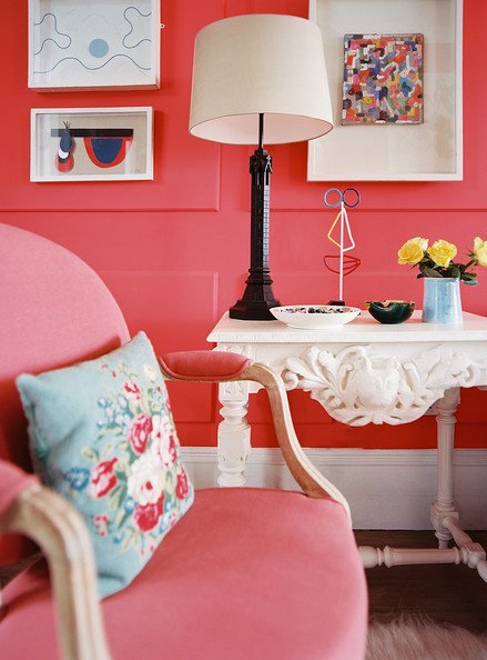
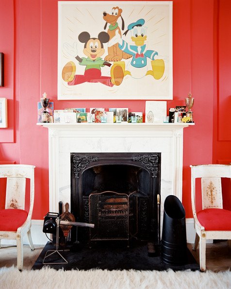
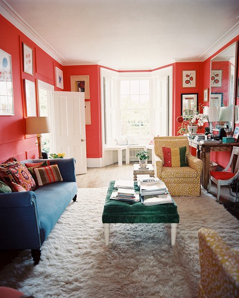
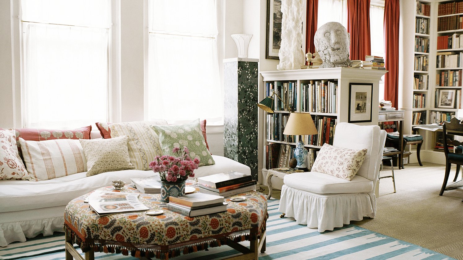
“People seem to be very drawn to this room with its colorful walls,” Kidston says of her living room, which she first painted a light neutral color and then repainted green before finally deciding on red as the best shade to accentuate the artwork. She also created a more relaxing sitting room to be enjoyed by the family. “When you have a sitting room that’s very formal, it’s not so friendly, is it?”
I think there are two types of people: those who see a flea market and can drive past, and those who must go in. I’m definitely the kind who must go in.
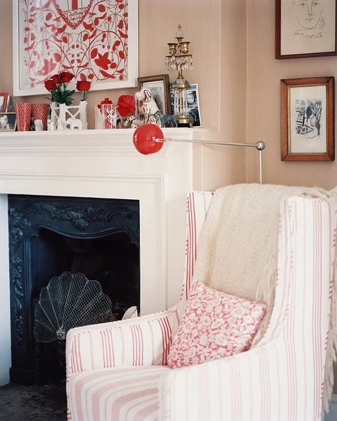
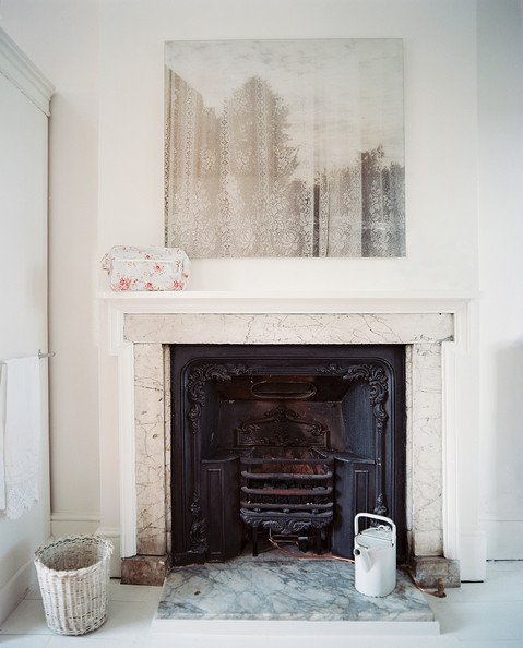
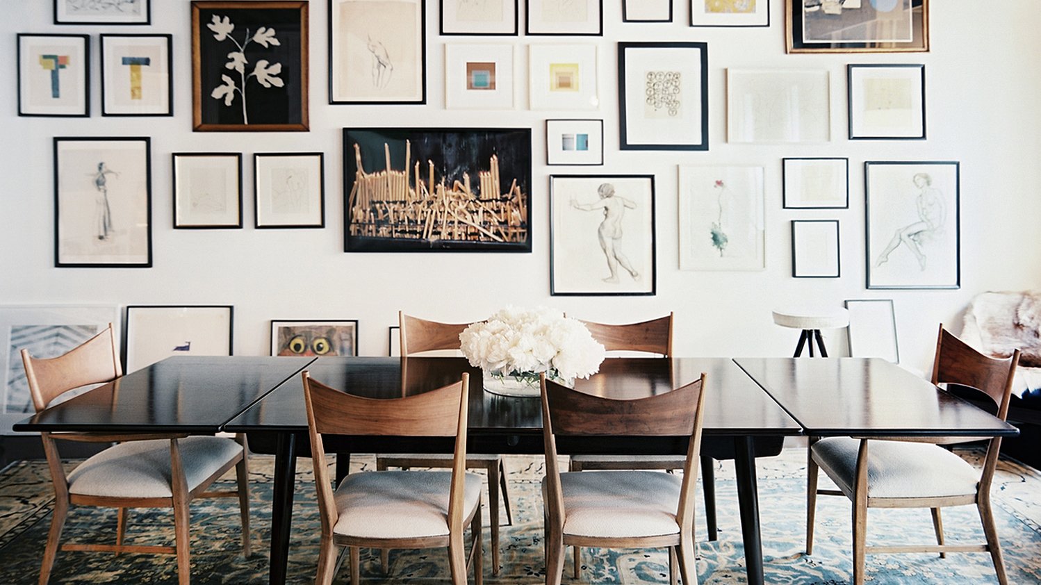
Kidston’s art collection represents both family heirlooms and pieces that she and Hugh picked up along the way. “It’s something we really enjoy together; looking for pictures, going to gallery shows, seeing what’s out there,” she says, describing her collection as “very personal.” Never one to be too serious, Kidston hung a Disney piece above the mantel. “It makes the room friendly,” she says.
Stick by your own convictions. If you love something, stick by it and don’t be afraid.
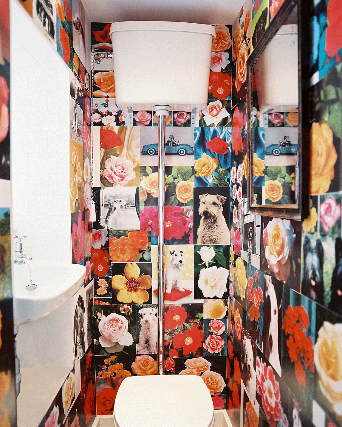
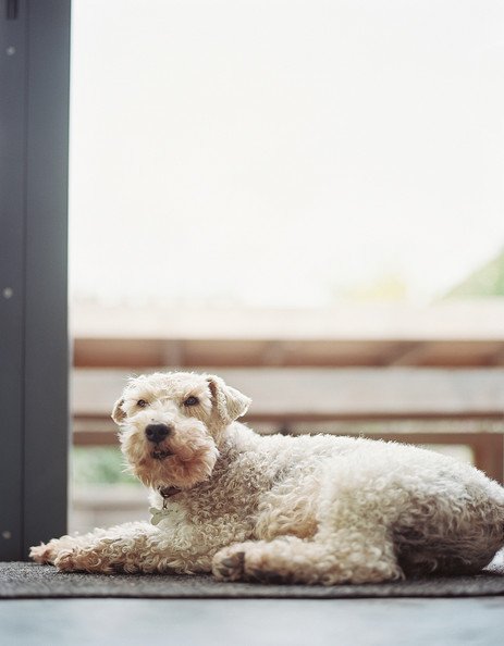
Kidston’s collage wall was created by longtime friend and artist Nancy Howard, of Nancy Howard Bespoke Collage Walls. Kidston originally wanted only images of roses, until Howard suggested including a snap or two of Stanley, Kidston’s Lakeland terrier. “That was the eureka moment,” says Howard. After a month of prep and a week of installation, the end result features dogs and roses, with subtle touches of humor that Kidston describes as “so English.”
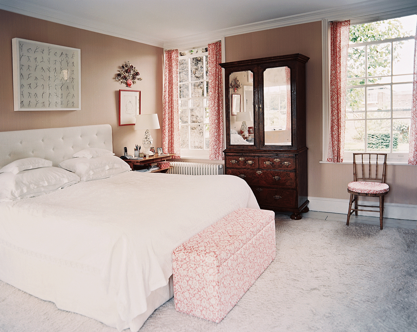
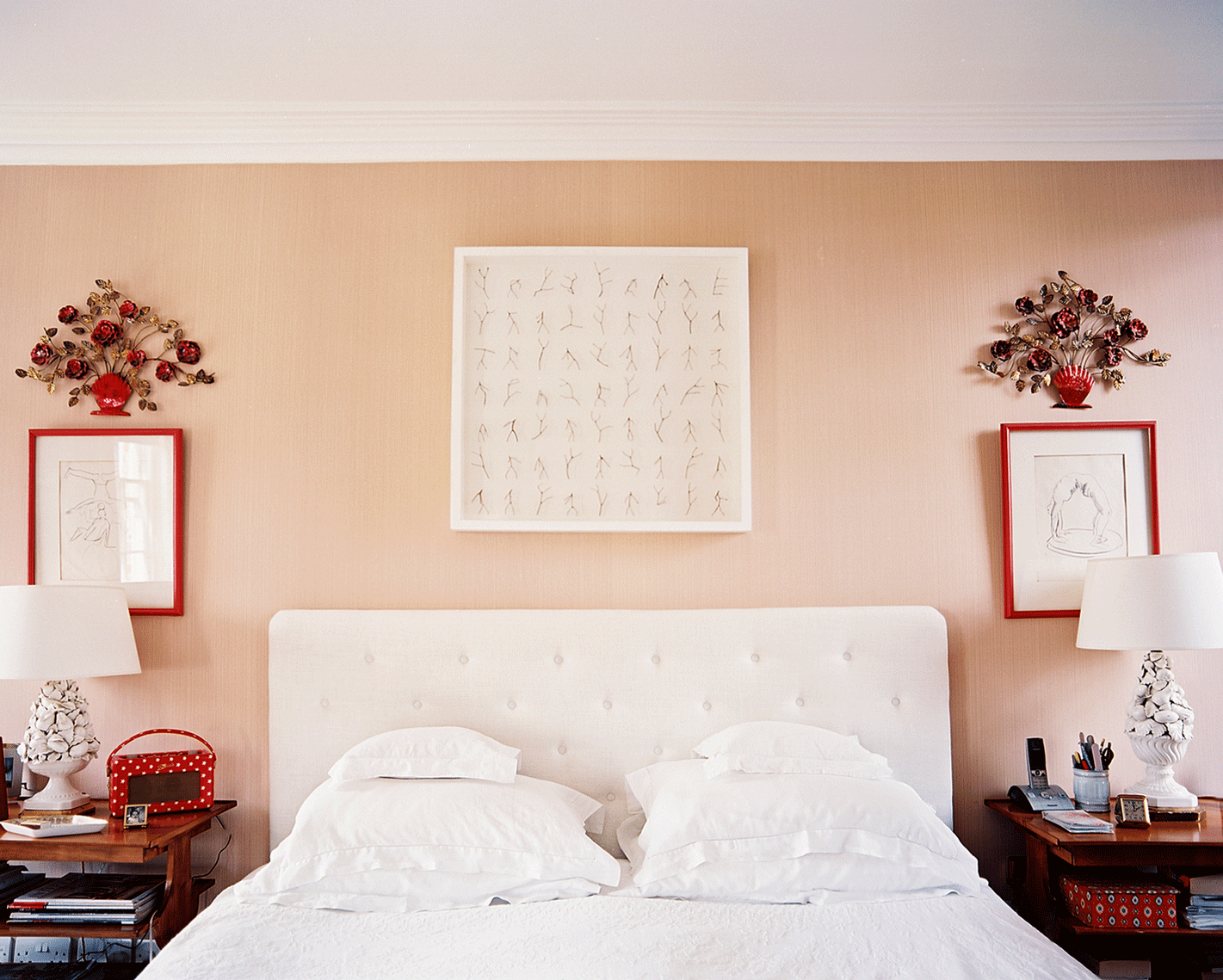
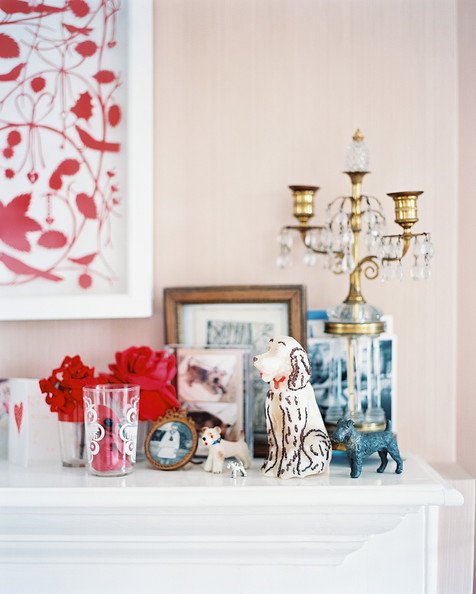
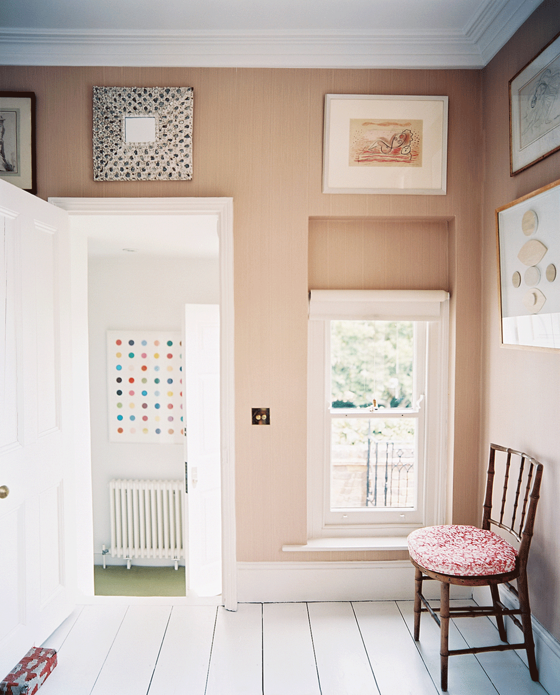
Kidston chose the primary bedroom as home to the family’s drawings, favorite pictures, and other precious odds and ends. “The objects in here are all very personal,” says Kidston, who kept the colors gentle in soft shades of red, white, and mushroom. “Because you want your bedroom to be quite calm, don’t you?”
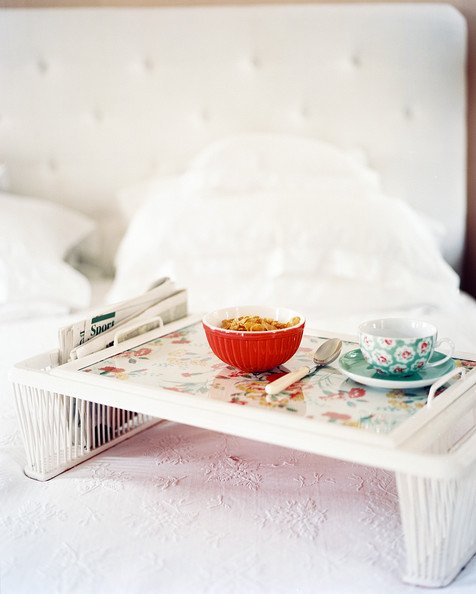
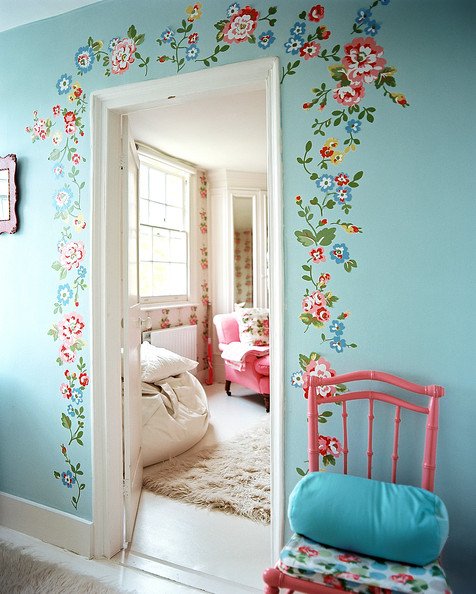
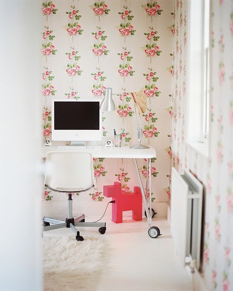
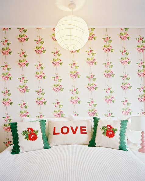
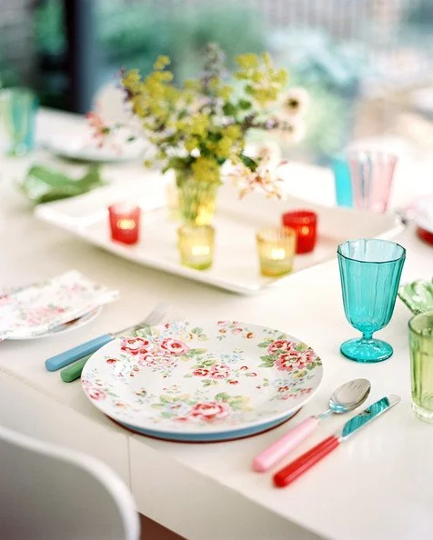
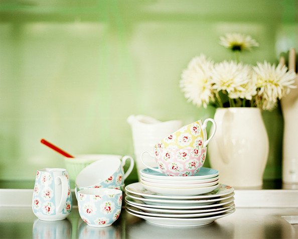
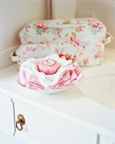
“Sometimes floral [fabrics] are best used as a statement piece versus flooding the room. For example,” she says, “take a very plain bedroom and add a floral linen to the bed so it is the only print in the room.” Kidston has also put this advice to work in her kitchen—a large, white, simple space that she’s brightened with floral-accented tableware. “Florals don’t need to be completely in your face,” she says. “You can use them in a subtle way because they bring so much character to a place.”
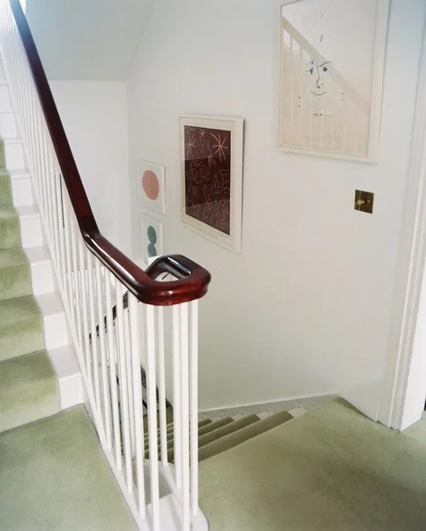
“I find natural-colored carpets rather dull and wanted something quite warm,” says Kidston of the green carpeting that runs along her stairway. “Strangely, it sets off other colors really well. The more I live with it, the more and more I love it.”
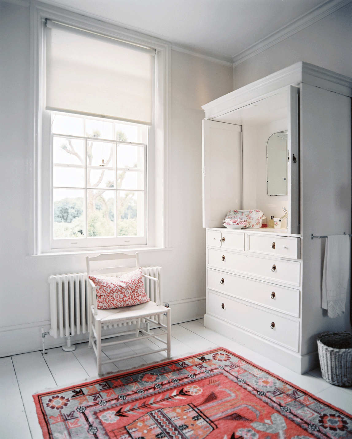
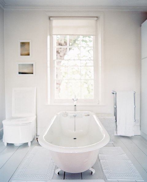
By hiding the sink in a cupboard, building an old-fashioned commode chair around the toilet, and placing the remaining cabinets down one side of the room, Kidston almost disguised the purpose of the bathroom—except for its one dead giveaway, a bathtub located in the center of the fairly large space. “It’s in its natural place because it allows you to look out the window to the garden. When you’re in the bath, a nice view is important.”
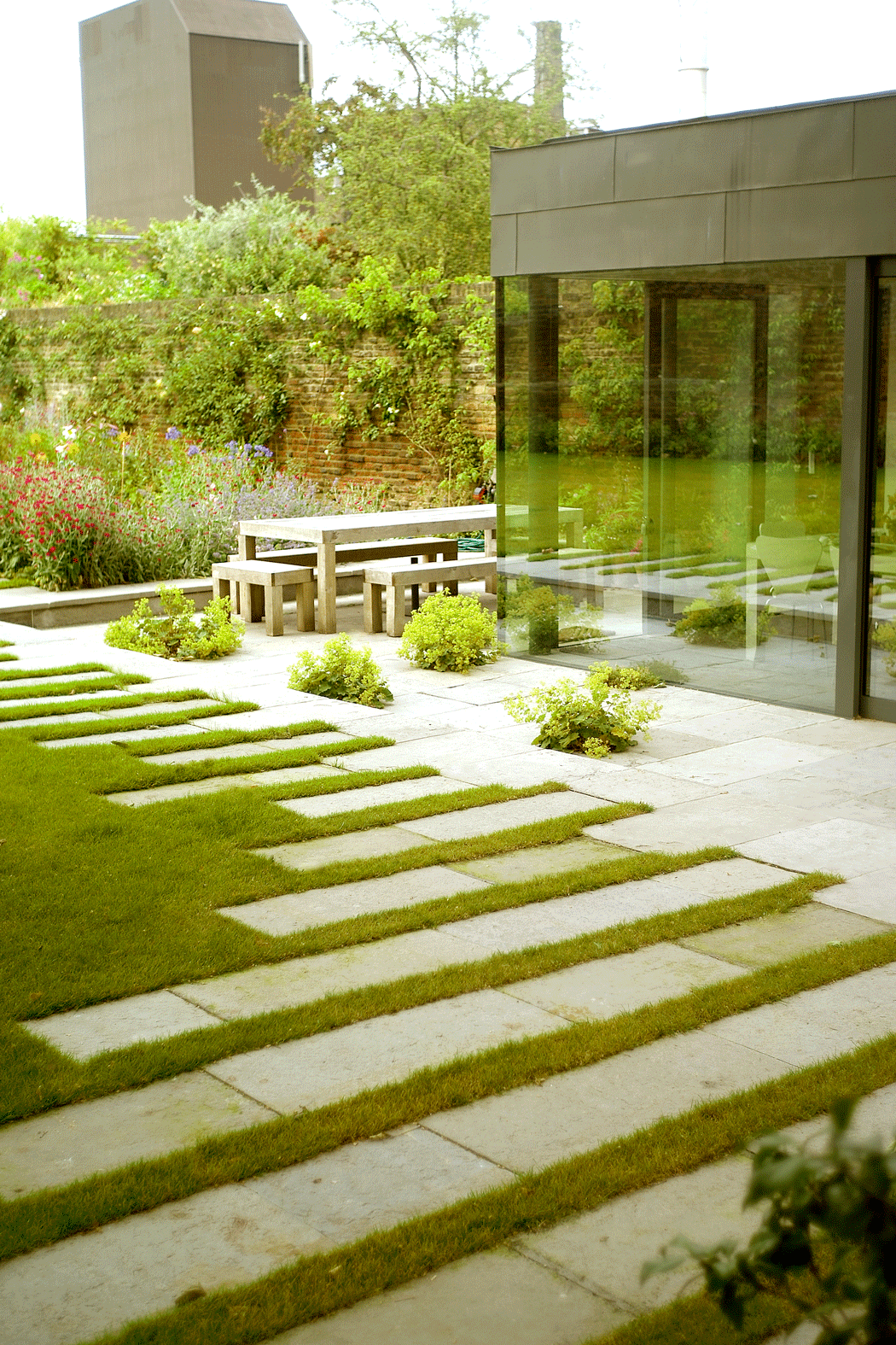
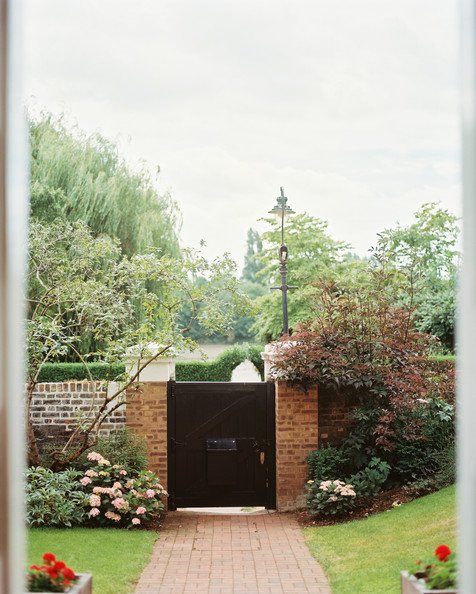
Instead of trying to recreate the historic feel of the home in the kitchen extension, Kidston and Padgham went in the opposite direction while renovating. “We felt like if we were going to [add on], we might as well do something very clean, simple, and totally modern,” says Kidston. They constructed the addition directly off the home’s 18th-century garden wall, seamlessly integrating the new with the old. “The kitchen has quite classical lines and is very plain in the way it was done, so we hope it’s a good marriage with the original, older building.”
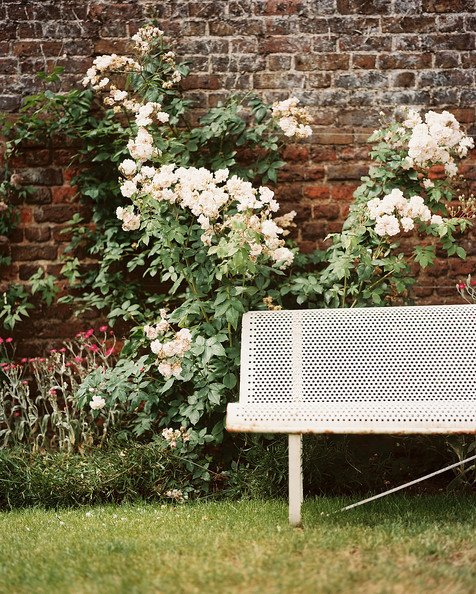
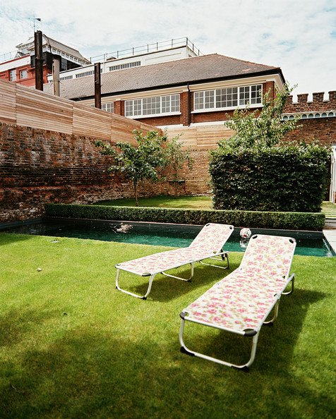
“This feeling of space and a nice big lawn in London is amazing. We’re so lucky to have it.” says Kidston.


