Project Nolita with Nick Olsen

Written by Shawn Gauthier | Photographed by Patrick Cline | Produced and Art Directed by Michelle Adams
Our product recommendations may include items from our sponsors and/or contain affiliate links, which means we may earn a commission when purchases are made. Rest assured, every item is genuinely chosen by our editorial team.
From Our Archives
Craving a new challenge, interior designer Nick Olsen revives a dark, cramped apartment to create a bold, Chinese-influenced escape.
In the spring of 2008, interior designer Nick Olsen got the itch for a new adventure. He sold all his belongings (save a few select pieces) and relocated from his Flatiron District studio to a Nolita one bedroom, swapping high ceilings and elegant architectural details for a dingy, dark apartment with a choppy layout and uneven flooring. Olsen was thrilled. “The apartment was the complete opposite from what I’d had before. I took it as an opportunity to do something quirky and intense, like an over-the-top jewel box on a smaller scale.”
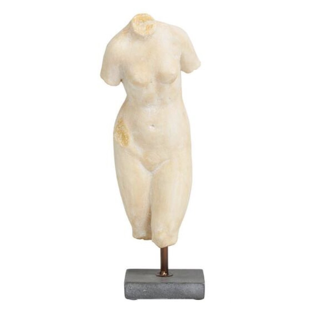
Not an unusual stance for Olsen; close friends have referred to his aesthetic as “maximalist,” to which Olsen agrees: “I’m not completely extremist,” he says, “but I don’t do things halfway, and I’m never restrained in my decorating.” With a keen interest in history, his style is largely contemporary while always maintaining a strong foothold in the past. “Ancient pieces have a grounding effect for me; if a space is without anything historical, it just feels too new,” says Olsen, who works to incorporate Greek sculptures and motifs or Roman busts.
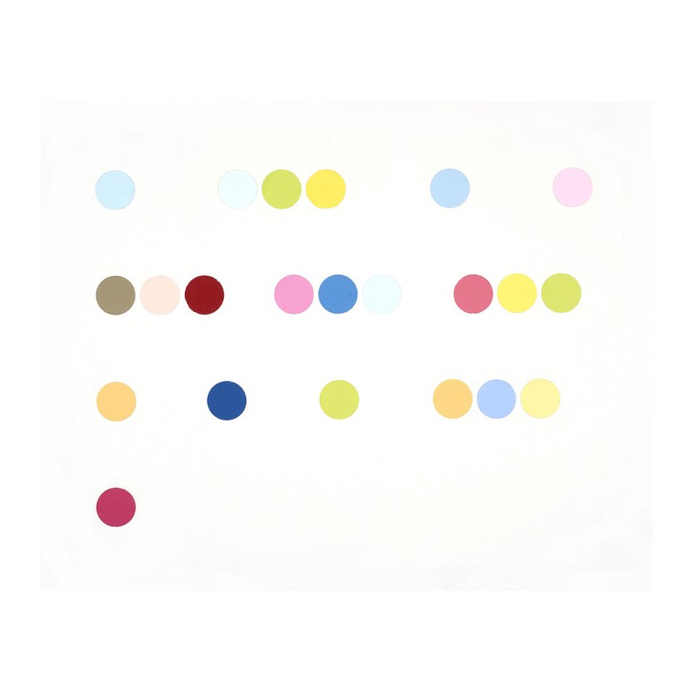
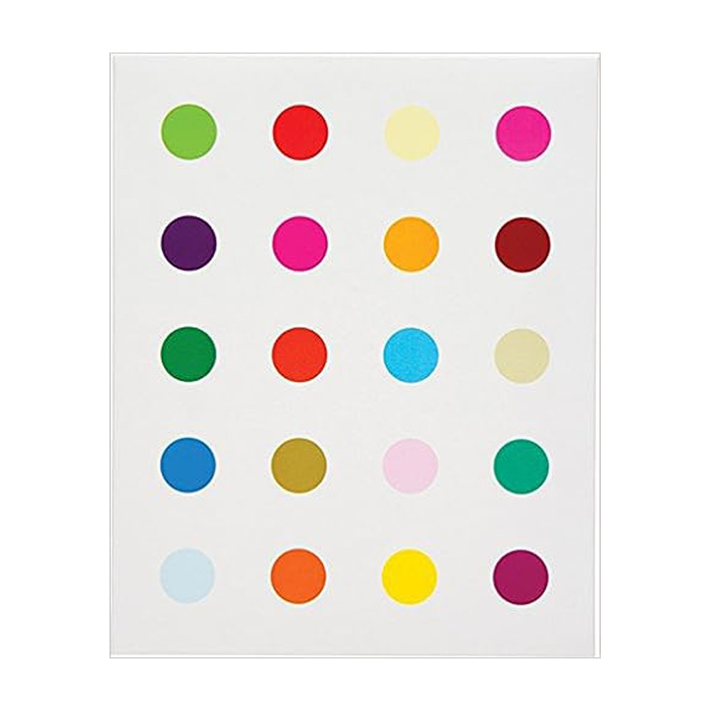
Paying homage to artist Damien Hirst, Olsen painted this polka-dot piece himself. “It proves that all colors really do go together!” he says.
Ancient pieces have a grounding effect for me; if a space is without anything historical, it just feels too new.
The oversized bedside lamps were a score at $10 each in Olsen’s hometown of Pensacola, Florida. “The lamps in this setting bring a power into the design, and they really pop against the wall,” says Olsen. “Scale is key.”
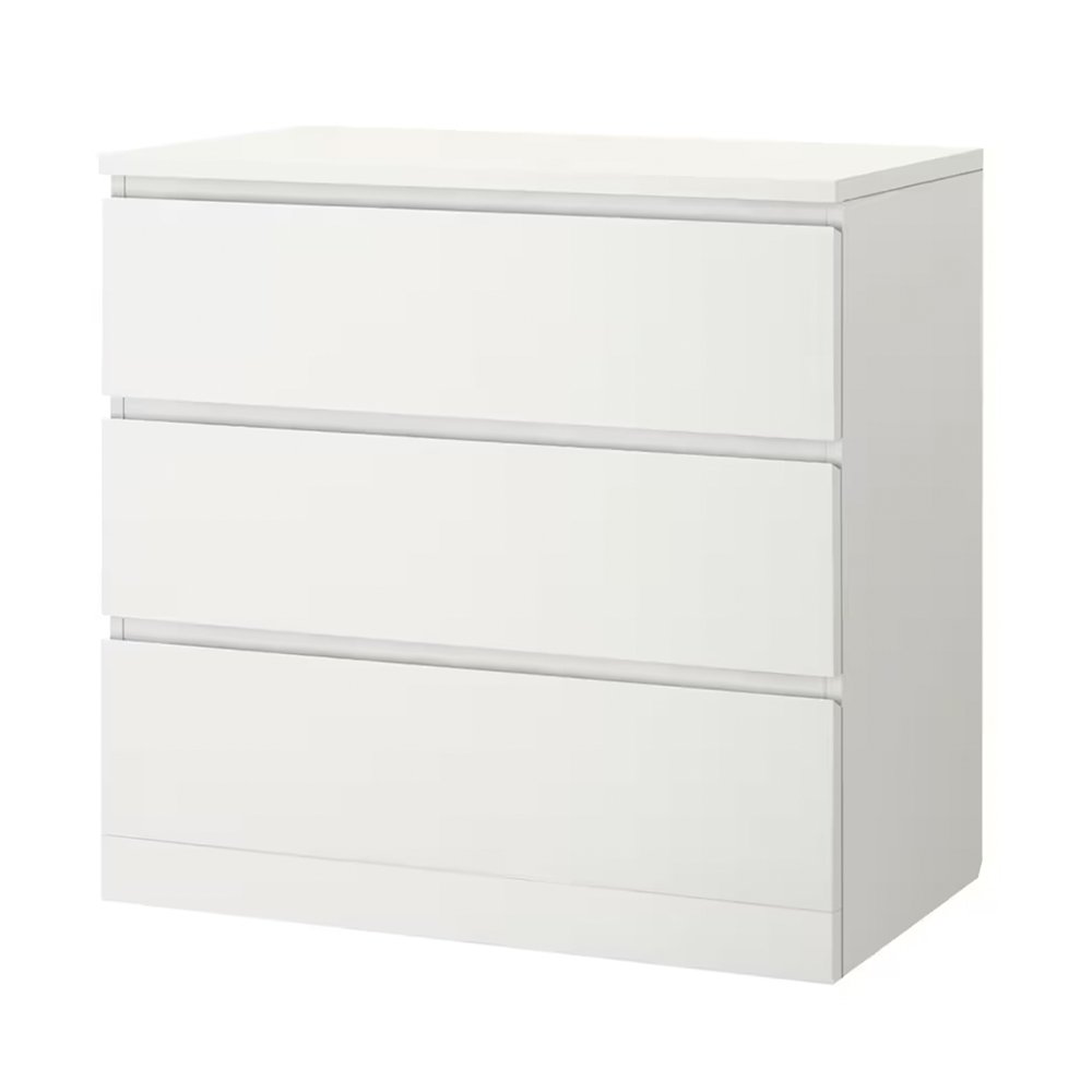
Olsen had originally planned to cover the IKEA melamine dresser with paper, but loved the red, gold, and white “under the sea” motif of this screen-printed fabric remnant he found at his upholsterer’s. “Screen-printing makes fabric very stiff, so it worked really well to cover,” he says.
Originally studying to become an architect, Olsen says the tables took an unexpected turn his senior year when he stumbled across a picture of interior designer Miles Redd’s townhouse in W magazine; his response to the décor was so strong he wrote Redd a letter, explaining himself and his interests. Redd called Olsen in for a meeting, and two weeks later hired him as his assistant. The designer worked by Redd’s side for five years, referring to the experience as his “education in decorating,” learning everything from color combinations and styling to functionally breaking down a room. “The most important thing he taught me was furniture arrangement and how to use a room to make the most of a space,” says Olsen. “Miles truly has impeccable taste; he’s influenced my current work in every way.”
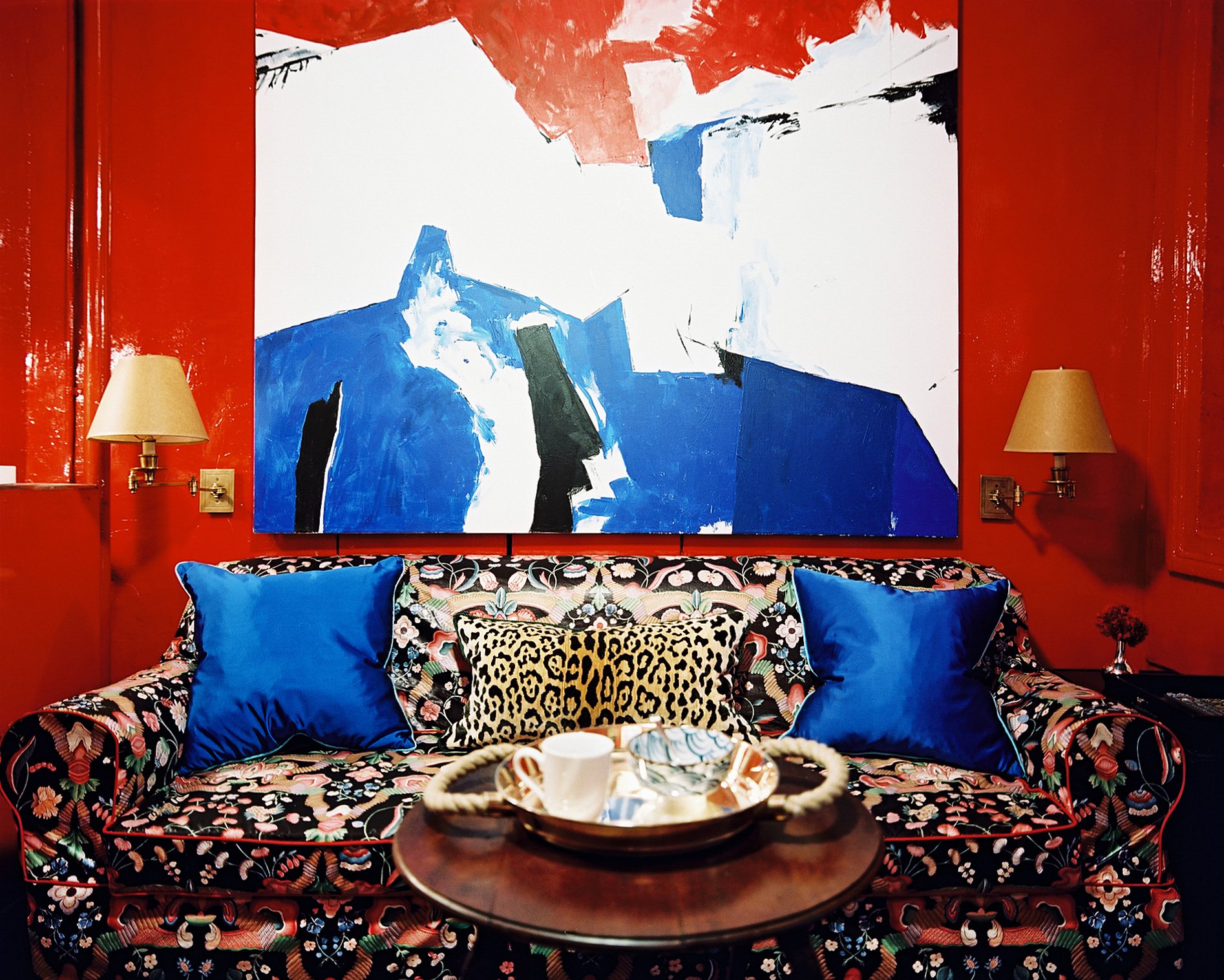
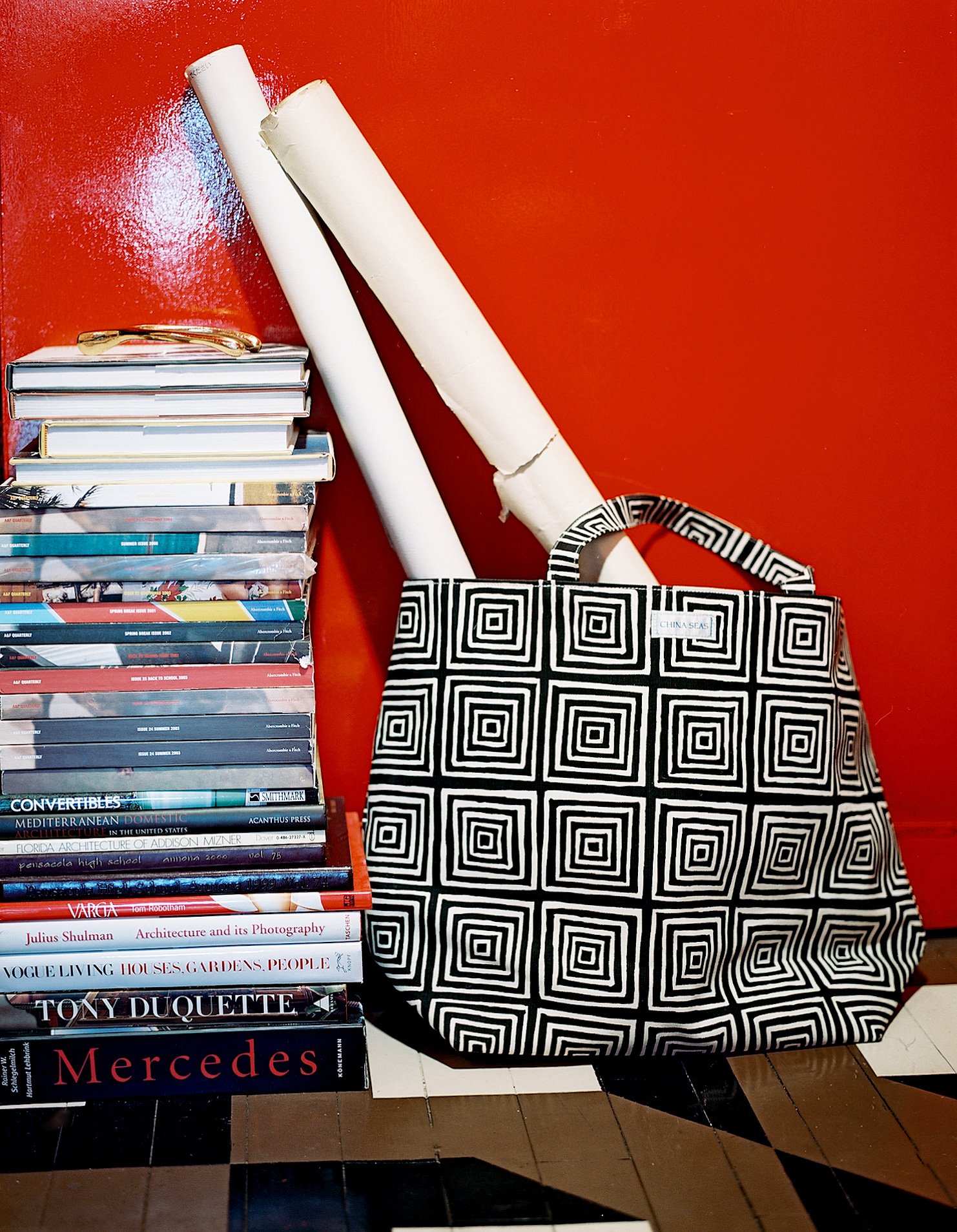
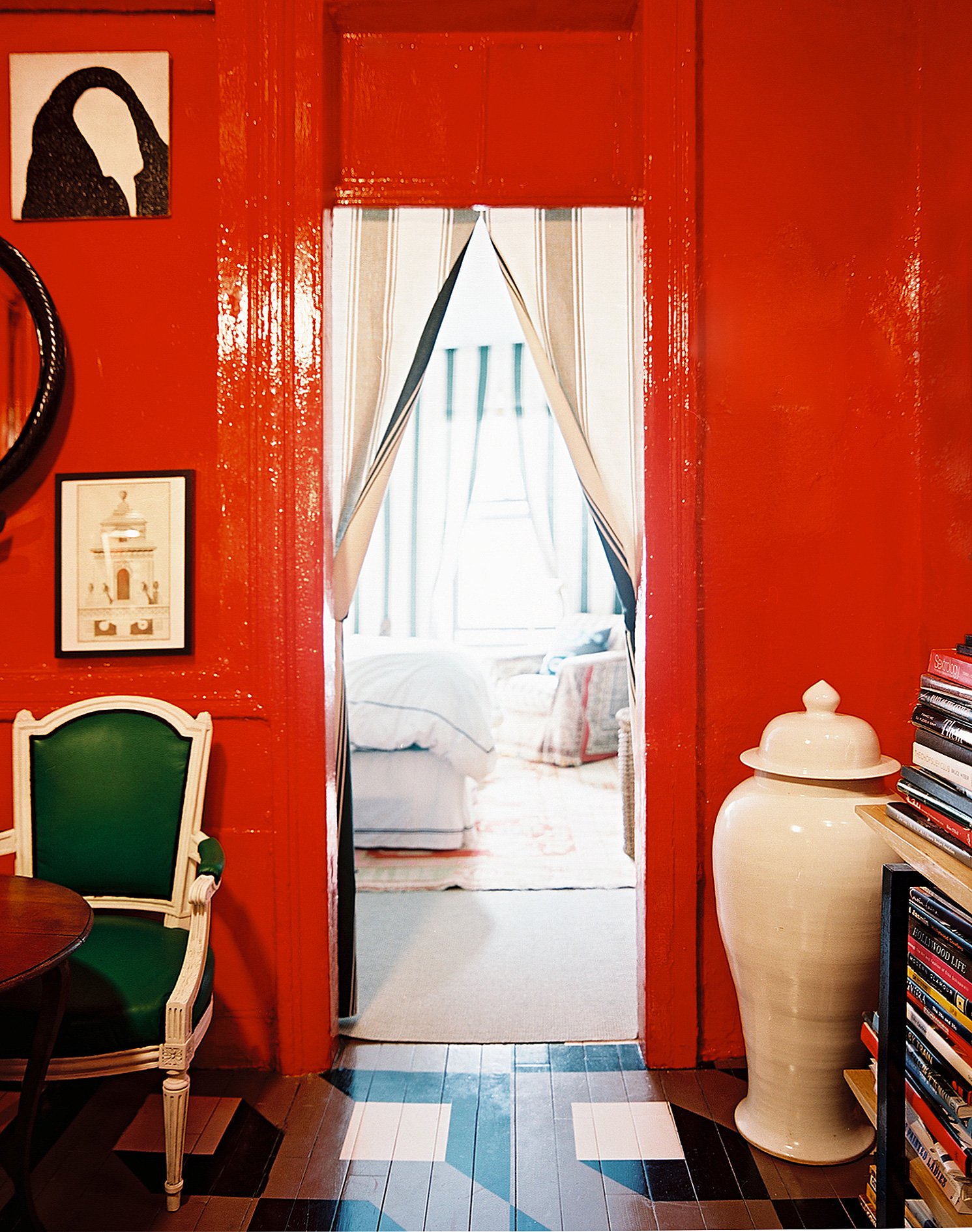
Inspired by a brief stay in Chinatown between apartments, Olsen envisioned a Chinese opium den–like experience for his Nolita apartment, resulting in the high-gloss red backsplash that excites the living room and kitchen walls.
I needed something for the foot of the bed, and when I saw this fake fireplace at a flea market, I knew it would be a fun addition.
In his previous apartment, Olsen had used a bold color but had painted all the trim white. This time around he went all-in with a vibrant shade of red on the walls, trim, and ceiling. “Paint is the single most transformative thing you can do to a room,” says Olsen. “If you can’t embrace changing a space with paint, your options become extremely limited.”
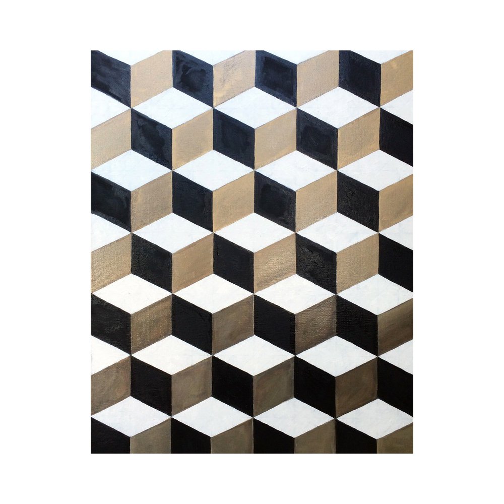
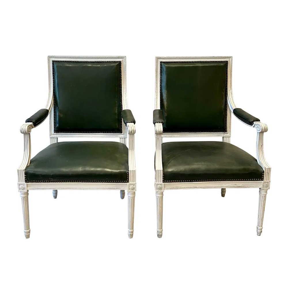
“My apartment is best described as a Chinese opium den meets glossy grandma,” says Olsen. “I love the style context of mixing chintz slipcovers and painted French furniture with modern elements like bold colors, abstract paintings, and a geometric tiled floor.”
“This lamp is my little ‘80s Memphis-lite moment!” Olsen laughs; he found it on the clearance rack at an NYU dorm-supplies store.
Having lived in studios until this point, it was also important to Olsen that he both maximize and celebrate his separate spaces. Aiming to create a cozy, intimate bedroom, he draped fabric against all four walls, staple gunning it to the ceiling and pulling it apart at the windows for instant curtains. “The bedroom gets such great light; mixed with the fabric, it creates this warm, tented, outdoor-like feeling, almost old English in a way,” says Olsen, who finished the space with wall-to-wall sisal carpeting.
Olsen also tackled several necessary renovations. He hired contractors to tear down a partition in the bedroom to create a larger space, and to rewire the lighting, which, Olsen says, “felt like a fire hazard.” Olsen himself replaced the kitchen island with an IKEA cabinet and even went to such lengths as removing the original refrigerator because of its bulk. “It was huge! I couldn’t stand it in my kitchen any longer,” he says; he now uses a mini fridge, kept under the counter butcher block.
Even though Olsen’s bedroom and living area feature two entirely different design approaches, there is still a level of continuity that runs through the apartment. “I maintained a color scheme, so that the bedroom is a variation on the dominant red and green from the living room but tweaked it to be more relaxing,” explains Olsen. “The look is intense but definitely fabulous.”
Paint is the single most transformative thing you can do to a room. If you can’t embrace changing a space with paint, your options become extremely limited.


