ARTIST & DESIGNER TIIU KARDI’S GRAND TOUR-STYLE APARTMENT

Written By Sarah Storms Greenwald | Photography By Kevin Kerr
Our product recommendations include items from our sponsors and/or contain affiliate links, which means we may earn a commission when purchases are made. Rest assured, every item is genuinely chosen by our editorial team.
The multidisciplinary creative’s Manhattan home is small space sophistication at its best.
Multidisciplinary creative Tiiu Kardi strikes a stylish work-life balance in the lavishly decorated apartment that also serves as her office
Growing up in the U.K. surrounded by her mother’s issues of American design magazines, creative consultant Tiiu Kardi describes “a fascination for a Miles Redd, Hollywood Regency style.” So when she moved to Manhattan from London two years ago, it was with a fervor for the unique type of glamour born in her adopted home. That is, until the nostalgia crept in. “Since I've moved to the States, I find I’m going more European: sort of a Givenchy, Grand Tour aesthetic,” she says of the decidedly neoclassical approach with which she decorated her 500 square foot apartment. “When you’re far from home, it’s nice to be surrounded by things that remind you of it.”
Grounded by stately antiques and auction scores shipped over from the U.K. and peppered with new finds from around the U.S., the richly layered space is a masterful bridge between her home country and her new stomping grounds. A paper mache bust from Florida’s venerable Casa Gusto, prints from a new favorite shop on Manhattan’s Lower East Side, and a curvaceous Christopher Spitzmiller lamp in the bedroom are just a few ways Kardi has incorporated American touches into her markedly European-feeling environs.
For the multidisciplinary creative, a typical work week might include completing textile designs for Schumacher, coordinating details for one of her overseas interior design projects, or partnering with an architect as a color consultant—and most of that productivity happens from this very space. “It's a bit like a creative laboratory,” says Kardi of her high-impact home base. Beyond its utility as a testing ground for decorating schemes, the colorful abode is a hub of productivity for her other professional pursuits. A cornerstone of Kardi’s practice are the room renderings she whips up for fellow interior designers, translating their spaces into gestural illustrations at the skirted six foot desk she keeps in the office area off the bedroom. The convenience of her new Manhattan address is a boon to her process. “If I’m working on a rendering and a client has specified a particular coffee table, I can just pop out to that showroom to see it and study angles that can’t be captured in a product photo.”
“It’s more soothing to me to be surrounded by items that feel collected and like they’ve had a life”
In the bedroom, the Schumacher-upholstered headboard lives alongside a glossy Christopher Spitzmiller lamp with a pleated shade from Bunny Williams Home.
A vibrant framed work by Jeremiah Goodman presides over an eye-catching intaglio dome made by Kardi and a decorative obelisk made by her equally creative mother.
An artfully layered corner by the window features a custom Chinoiserie panel, a gilt tassel chair, and pieces by Kardi herself: framed intaglios and handmade bases for two vintage brass obelisks.
With the eye of a collector and the skill of an artist, Kardi drew on an innate visual sense to craft an enviable mix of eye-catching drama and livable flow. “Whether it’s interiors or textile design, it's all about your layout, your balance, if the color proportion is looking good,” she says of the crossover in her creative disciplines. There’s an undeniable fearlessness to Kardi’s approach to layering pattern, texture, and scale, especially in a space some might consider small. “It’s more soothing to me to be surrounded by items that feel collected and like they’ve had a life,” she says.
The trick to creating lavish layers that don’t overwhelm a tighter floor plan? Kardi says it’s vital to create a visual “running thread” through disparate areas. Walls in Benjamin Moore’s Vero Beach Tan “give the eye a bit of a respite,” and provide a foundation upon which to add vibrant touches of color. Lush greens are threaded throughout: from the showstopping Elitis velvet-upholstered sofa to the Schumacher kitchen wallpaper and skirted desk fabric. But it’s the exacting “thimble full of red” that Kardi sees as the real unifying stream in her home, inviting the eye to follow touches of crimson from the hallway runner to the wall medallion, the bed’s headboard, a well-placed coffee table book and the piping on an accent chair.
It takes a precise vision to pull off such sumptuous maximalism without the requisite Palladian square footage, but Kardi is always open to the next find. “Whether you’re a designer or just a lover of things, you never truly stop, do you?,” she says of her tendency to add, not subtract. To that end, she has begun making her own obelisks and intaglio domes to display. And as for her next auction score, she’s already doing her part to will it into existence. “One day, I would like a proper neoclassical marble urn in this space,” she says. Until then, she’s drawn two shapely urns and hung the art on either side of the living room sofa. “It’s a little bit like manifesting.”
In the office area, Kardi’s skirted desk is trimmed with a Greek key tape by Samuel & Sons and flanked by a screen covered in cheery yellow wool by Larsen. In keeping with her “Grand Tour” aesthetic, Kardi crafted the framed intaglios for the space.
Kardi’s elegant room renderings draw on her talents as a painter and graphic designer to translate interior designers’ finished spaces into art.
The jewelbox-like living room is dressed in sumptuous velvets by Elitis and Scalamandre and gleams with gold touches like a tassel-tipped cocktail table and brass light fixtures.
Small Space Solutions That Don’t Sacrifice Style
Opt for moveable “walls”
Kardi has two folding screens in her apartment – a custom upholstered one that she puts to work dividing the entry from the living area, and another lightweight one she stashes until it’s time to entertain. “I’m not an open plan person, I like things zoned.”
Make a true entryway, no matter how small
Kardi turned a previously overlooked nook into a stunning stopover when entering and exiting the apartment. “If you’re going to walk past something every day, make sure it's not an energy deflator.”
Infuse Storage with Style
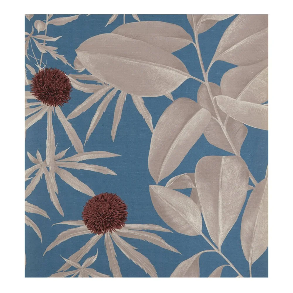
Kardi customized storage bins with Schumacher wallpaper, reasoning, “if you take something useful and tart it up it can be super functional and nice to look at.”
Don’t shy away from personalizing a rental
From painted walls to custom drapery and a wallpapered kitchen, Kardi customized much of her multi-year lease.
Create a visual “running thread”
In the hallway, Kardi applied black grosgrain ribbon to emphasize the outlines of door frames. In the kitchen, she used black electrical tape to mark drawer pulls (“Nick Olsen-style”). The headboard in her bedroom picks up the grosgrain trick again.
A paper mache medallion from Casa Gusto pops against walls painted Vero Beach Tan by Benjamin Moore.


