A Timeless Renovation, Part Five: Curb Appeal

Written by Michelle Adams | Photographed by Marta Xochilt Perez
Our product recommendations include items from our sponsors and/or contain affiliate links, which means we may earn a commission when purchases are made. Rest assured, every item is genuinely chosen by our editorial team.
Brought To You By Our Friends At TimberTech
Lonny editor Michelle Adams shares a dramatic before-and-after transformation and tips for adding curb appeal.
Before
Before the renovation, our home felt dark, dated, and distinctly masculine. The facade featured three different types of siding, each in a different color, and the porch seemed to disappear into the shadows. After applying three coats of crisp white paint, we were able to unify the exterior and brighten up the entire space, creating a fresh, cohesive look.
Welcome back to our renovating series! If you're just joining us, we’ve been transforming our 90’s-inspired ranch since the spring of 2022, documenting the process in a ten-part series. In Part One, we turned our dated pool into a resort-like oasis; in Part Two, we built a beautiful new deck to upgrade our outdoor space; in Part Three, we refreshed our primary suite; and in Part Four, we reimagined our living room, kitchen, and dining areas. Now, in Part Five, we’re excited to share how we boosted our home’s curb appeal with some thoughtful exterior upgrades.
View From The Street
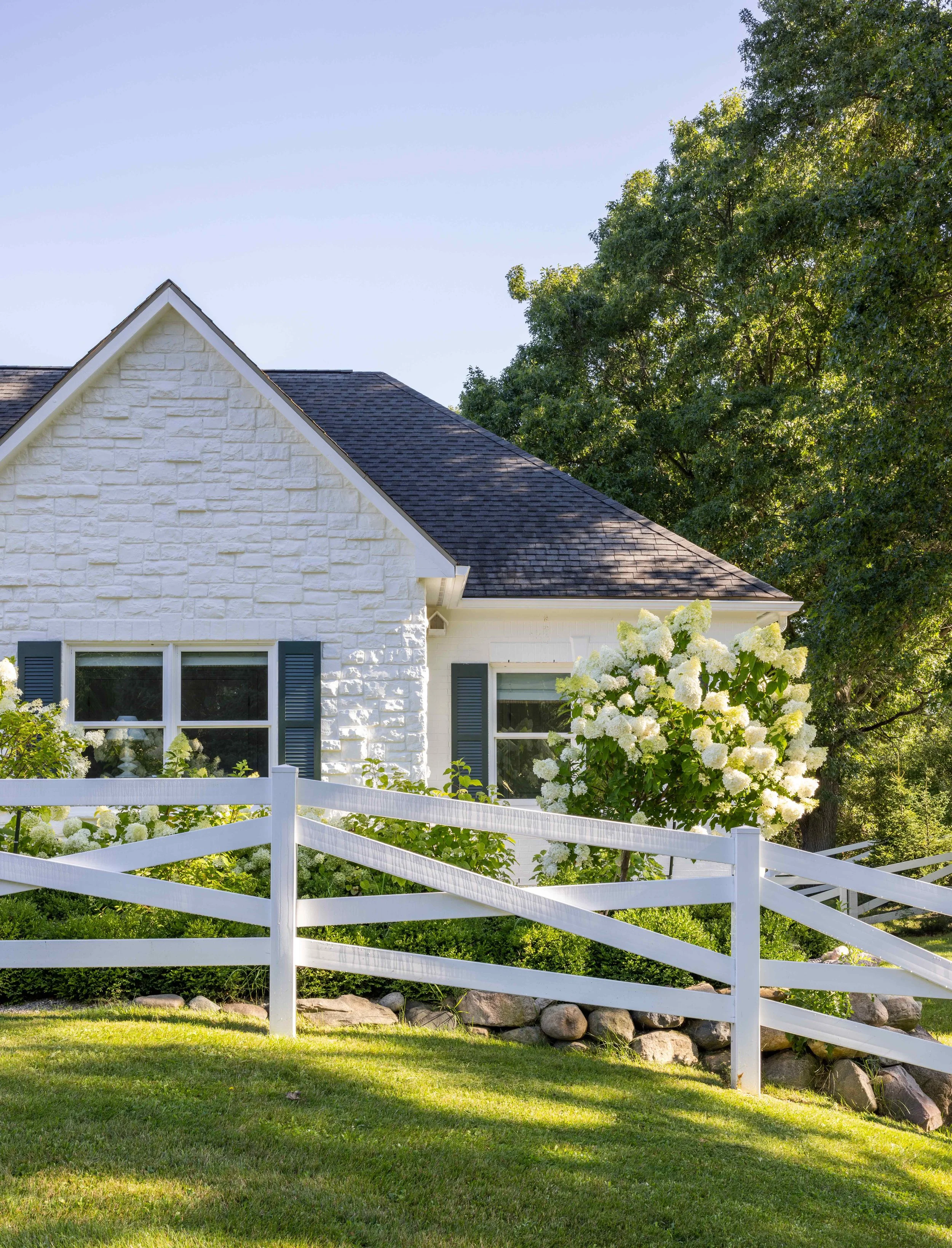
When we bought the house, the facade was dark, masculine, and dated. Facing the street was a combination of brick, stone, and wood siding, while the sides and back of the home were covered in a composite product called Smart Lap, which was painted a purplish-gray. I wanted our home to evoke the charm of a classic country ranch, so I started by painting every surface in All White by Farrow & Ball. It took three coats to cover the formerly dark home, but once it was finished, the transformation was stunning. The consistent white unified the many types of siding while accentuating their natural textures.
Once the house was painted, it became clear that it needed a bit of contrast, as the bright white was almost too harsh on a sunny day. I spent some time hunting for affordable wood shutters that we could paint in a deep, contrasting green, and fell in love with a solid wood louvered style by Ekena Millwork. (We installed them using this hardware.) At the time, the pre-painted green version was out of stock, so I ordered the shutters unfinished. However, if you're hoping to mimic the look, you're in luck, as Ekena Millwork's Thermal Green is currently available—and looks like a great option.
After the facade was cleaned up, it was time to address the landscaping. I'm a fan of simple and repetitive plantings, so I lined the front walkway with boxwoods and hydrangeas—both in tree and plant form—to create staggered heights. The flowers turn pink in late August, adding even more contrast with our white home.
Once the flowers were planted, I knew we needed to fence them in, as we have plenty of curious deer running around our neighborhood. So, I extended the white crossbuck fence from our backyard up to the front walkway, which added equal parts protection and equestrian charm.
An equestrian inspired crossbuck fence keeps deer from eating our flowers, and adds much-needed curb appeal.
Boxwoods and hydrangea offer a classic and low maintenance look.
Hydrangea trees grow tall and wide to create landscaping that's proportional to our home's facade.
Our newly painted front porch was given a timeless look with column wraps by AZEK.
Before
Before, our porch was so dark that it could barely be seen from the street.
A Welcoming Entry
Originally, our front porch was very dark and barely visible from the street. The roof was supported by a wood-wrapped 4x4 post that felt unfinished and disproportionate to the scale of the entry. I wanted our home to have a more classic feel, so I made a relatively small change that had a huge impact—a column wrap. AZEK makes a great wrap that's easy to install and stands up to harsh weather. Three connected panels and a fourth "locking" panel fit easily and securely around a structural support (like our existing 4x4), with press-fit seams and clean corners. To make the column more proportional to our home, I chose AZEK's Crown Kit, Base Kit, Accent Wrap, and XL Bed Kit. We also installed two additional matching columns flanking the porch to make it feel even more grand.
Next, we tackled a much-needed upgrade for the dated front door. To stay on budget and on schedule, I found an in-stock pair of classic 9-lite French doors from Home Depot in knotty Alder wood. We painted them in the same green and had our contractor build a custom transom above them to bring more light into the entry.
Finally, we dressed up the doors with polished nickel hardware from Emtek for a timeless, traditional look. I chose the Wilshire Sideplate with the Waverly Knob for each exterior entrance on our home and barn. This combination provides the stately, historic feel I hoped to infuse into our home. The entry was completed with a polished nickel Stretto doorbell that softly glows to welcome guests.
Yes, that's a bird house up there in the corner. I thought it would help keep the robins from wanting to nest on our cozy porch...we'll see if it works next spring!
A maintenance-free TimberTech deck has become our go-to hangout spot.
A New Point of View
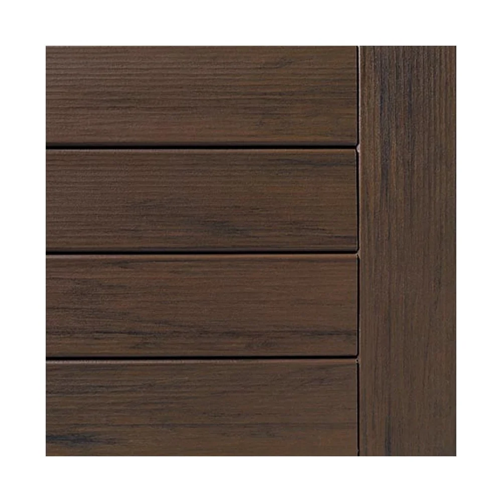
While our deck is located at the back of our house, it remains visible from the street as you drive by. Our original deck was an eyesore—not just from the road but also from inside our home, as nearly every room offers a view of the backyard. When we moved in, the deck was rotting and splintered, featuring a chunky railing that obstructed the spectacular views of the wetlands behind our house. To transform the space, we partnered with our friends at TimberTech and created our new favorite hangout spot, now splinter-free. The deck boards are engineered to look and feel like wood but are made from over 110,000 plastic bags that would have otherwise ended up in a landfill. They’re maintenance-free and incredibly smooth underfoot. The cable railing provides an unobstructed view of our property, while the accent lights and lighted island cap automatically turn on when the sun goes down. You can check out a detailed before-and-after feature here.
Our smooth deck boards look like real wood, but are made from over 110,000 plastic bags that would have otherwise been sent to a landfill.
Lazy mornings spent on the deck.
Rufus's favorite spot to snooze on sunny days.
Classic posts help our modern cable railing feel traditional, while the cable ensures uninterrupted views of our property. NDI faux boxwoods help define the space and make the seating area feel more cozy.
The new garage and barn doors from Clopay bring a distinct charm to our home and barn, while the Chippendale-style deck gates from TimberTech add a touch of history and craftsmanship.
Extra deep steps allow space for Rufus to lounge.
This side of our deck is visible from the road as cars drive by, so it was important to add curb appeal here too.


