A Timeless Renovation: Series Introduction

A peek at our latest renovation project. (Left) Our living room in the process of getting some much-needed symmetry and charm, (Middle) Rufus and Trixie weigh in on their favorite TimberTech deck samples, (Right) Our brilliant carpenter, Jeanmarie Ulrich, hard at work with our go-to builder, Chuck Braham.
Written by Michelle Adams
Our product recommendations may include items from our sponsors and/or contain affiliate links, which means we may earn a commission when purchases are made. Rest assured, every item is genuinely chosen by our editorial team.
Lonny editor Michelle Adams shares how she gave her 90’s-inspired home a timeless update.
When removing the 90’s look from our home, an important factor to address was the honey-colored flooring. Rather than lightening the floors, a look that’s very popular right now, I decided to test out several shades of deep brown and charcoal for a warmer alternative.
Hello there! It's Michelle Adams, and I'm thrilled to share something special I've got in store—a series documenting my latest renovation project. For the past year and a half, my husband and I have been remodeling our new home, attempting to remove its decidedly 90s look and to update it with a design that can stand the test of time.
The key to updating such a property is to ensure that the old trends are not replaced with new trends, as they, too, will become dated with time.
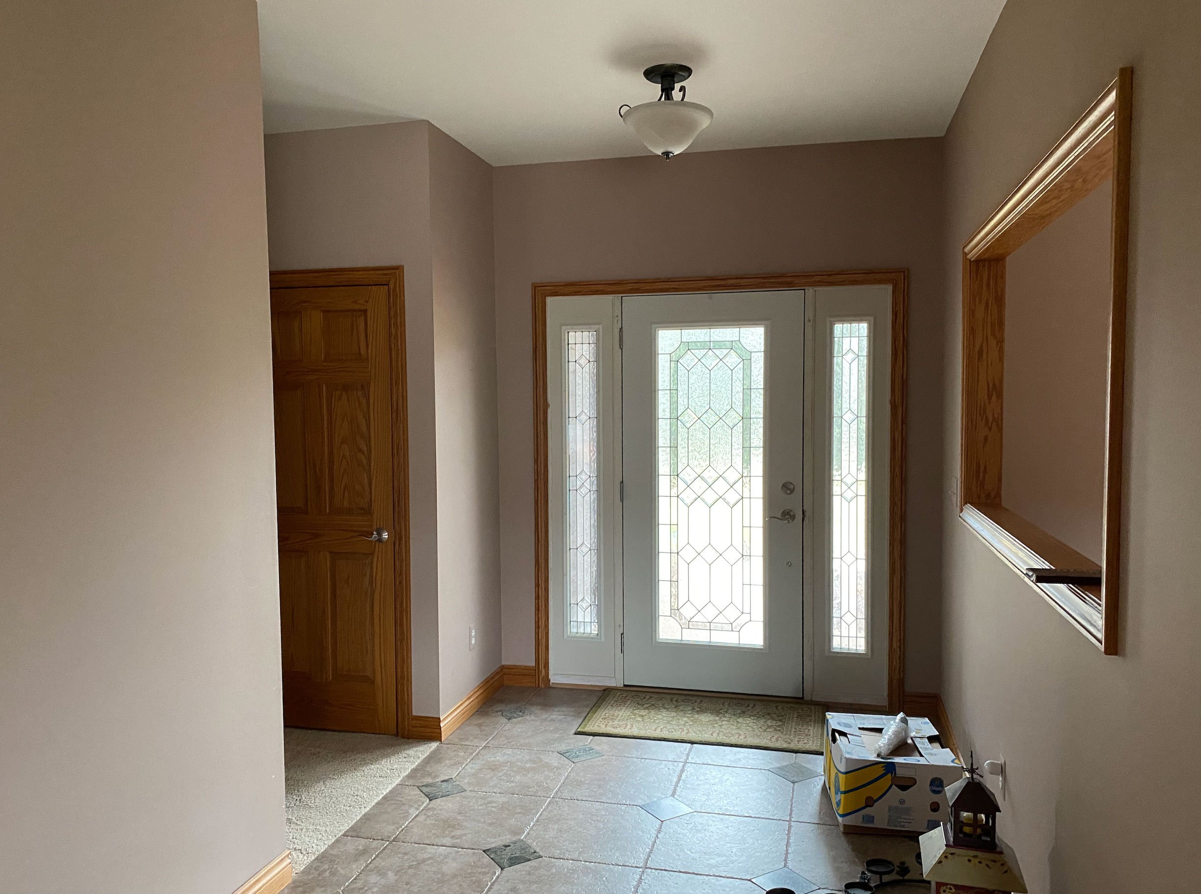
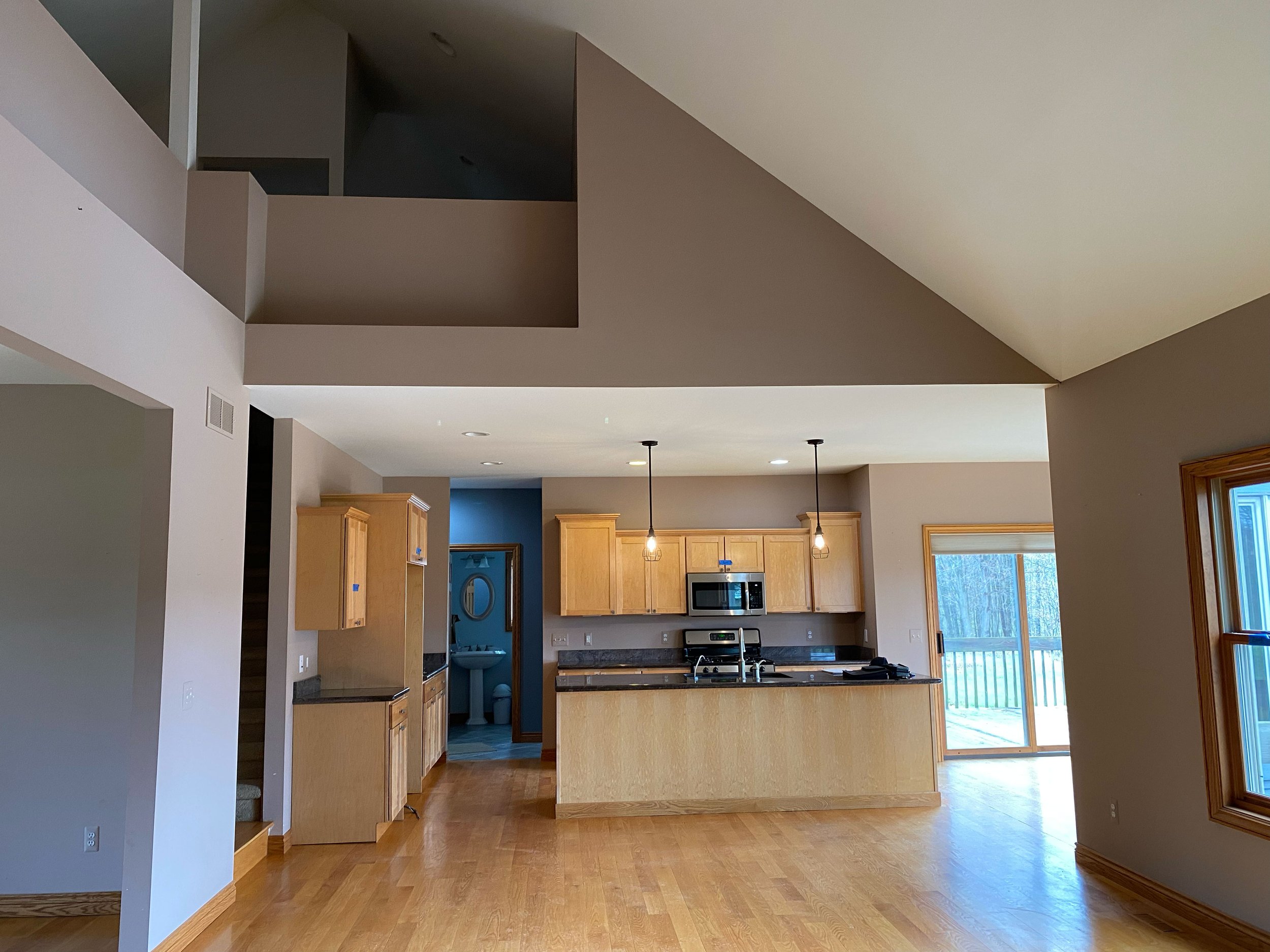
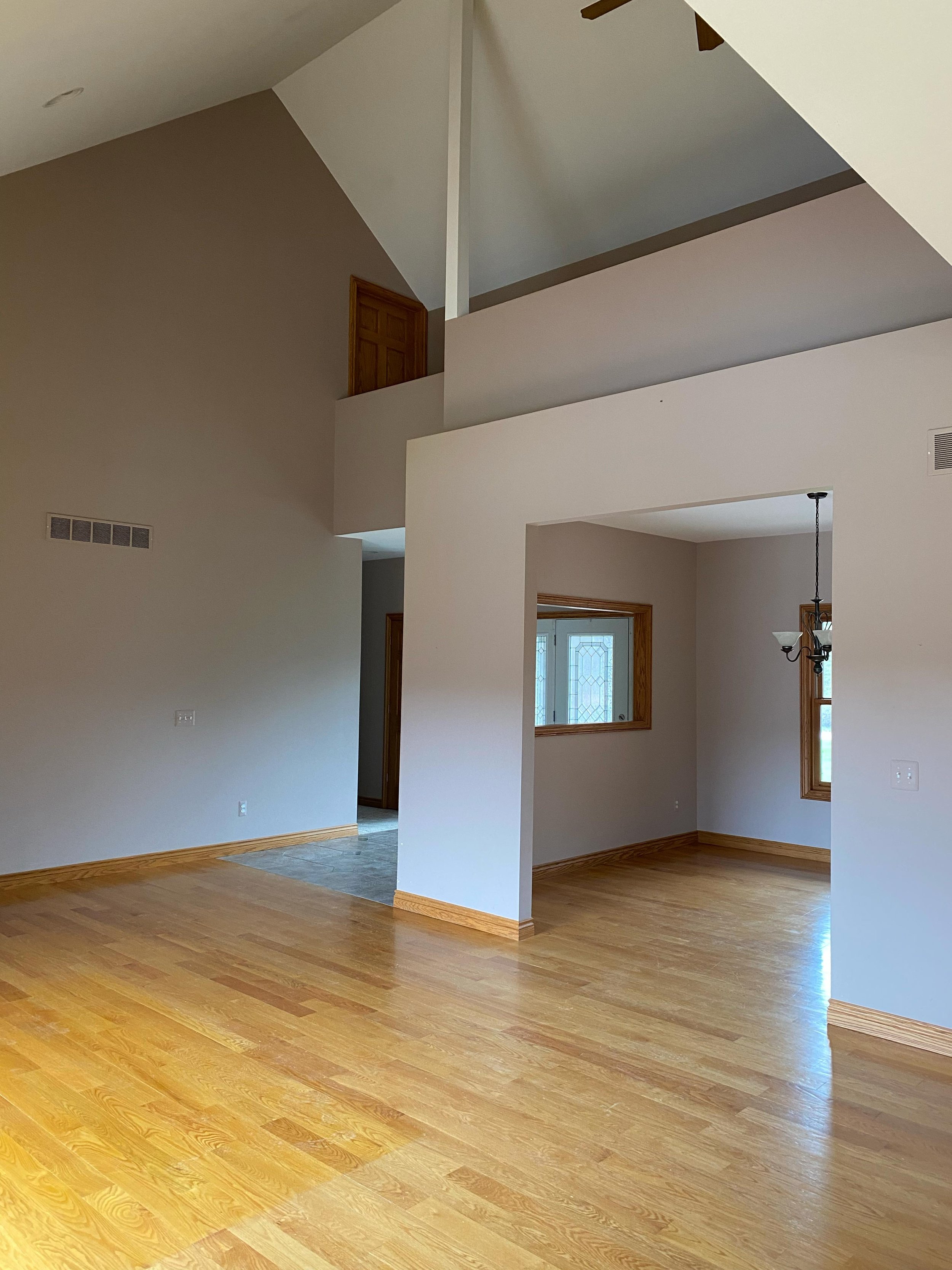
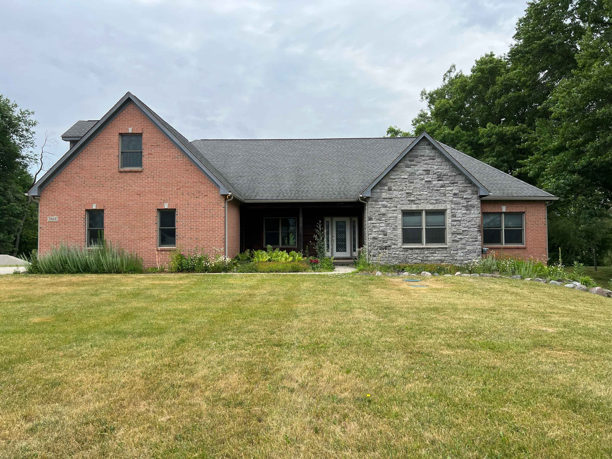
While our home was solidly built in 2003, the original builder drew inspiration from the previous decade’s top design trends, selecting everything from mauve-painted walls to honey-colored floors and trim, a diagonal whirlpool tub, maple cabinets, wall cut-outs between rooms, and so on. In the early 2000s, these features surely felt fresh and of-the-moment, but with time, such trendy design choices came to feel dated, as all trends eventually do. The key to updating such a property is to ensure that the old trends are not replaced with new trends, as they, too, will become dated with time.
You might wonder why a design lover like myself would have purchased a dated home, and that’s a fair question. During our house hunt, the market was at its peak, and we were outbid on eight different homes. A few of the houses we loved flew off the market before we’d even had a chance to write an offer! So, it soon became clear that in order to get a home that we could afford and that checked most of our boxes, we’d essentially have to create it ourselves. I know a lot of people are in this same boat right now, so I thought it could perhaps make for an interesting series documenting our design decisions, and explaining what makes our new home’s design more timeless. In this series, I’ll also be sharing my favorite resources, a few of my builder’s genius tips, and some cool sustainable finds.
When our 90s-inspired home hit the market, I could immediately see its potential. Regardless of the home’s dated design, it was lovingly built by a skilled contractor who went the extra mile to construct a terrific home for his family. This meant that we wouldn’t need to spend our renovating budget on issues like shoring up a foundation, replacing plumbing and electric, installing new windows throughout, etc. What’s more, the property is in a peaceful country setting that backs up to a protected wetland area, which means our home has some pretty incredible views, year-round.
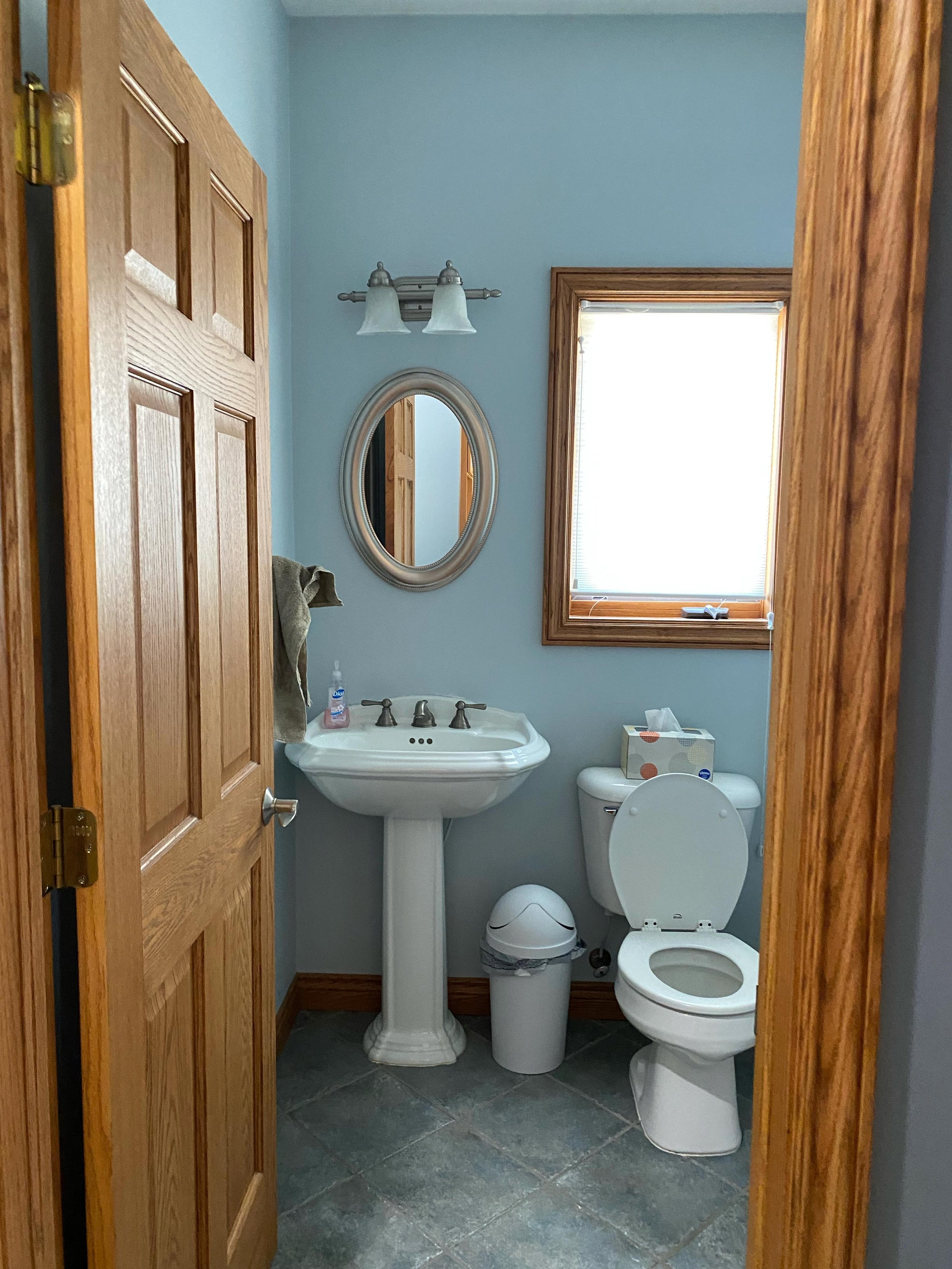
So here we are, ready to share the reveal in a ten-part series that starts next week and will run through early winter. We’ll be kicking off the series with a dramatic before-and-after of our backyard and pool, for which we took inspiration from Blackberry Farm as well as the Grand Hotel here in Michigan. Can’t wait to see you back here, soon! In the meantime, here’s a peek at a few of the before photos.


